Neon website UX review
A scan-backed analysis of how Neon performs across usability, visual clarity, and UX best practices. Use it as a reference for what to borrow, what to question, and what to test on your own site.
Sensei score: 77 out of 100
Aesthetic
79Practices
78How Neon looks
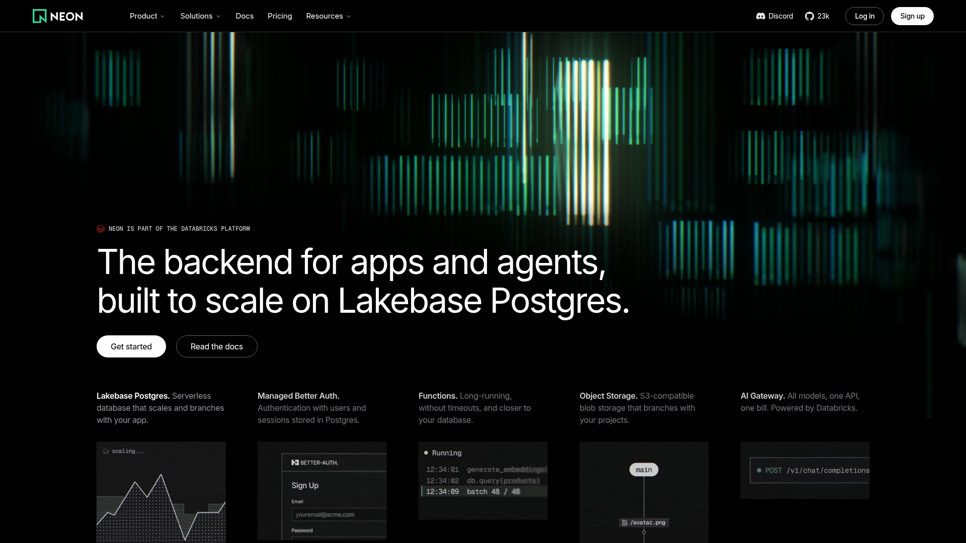
The verdict
A technically confident page that obscures its own value
Neon's landing page scores 77/100—a strong result that masks a fundamental misalignment between what the page says and what it should convince visitors to do. The aesthetic layer (79) and practices layer (78) both outpace the functional layer (75), suggesting the page looks polished and follows many design conventions, but fails at the core job of explaining why developers should sign up. The gap is not accidental. It reflects a common pattern in infrastructure-software marketing: leading with architectural capability instead of user outcome.
Observed UX signals
- Majorfunctional
Clarity
Hero headline leads with technical feature ('built to scale on Lakebase Postgres') rather than user outcome. The benefit—why developers should care—is buried. A 12-year-old cannot explain what this product does from the headline alone.
- Majorfunctional
Trust & Credibility
Social proof is sparse and lacks specificity. '15,000,000 Postgres databases started daily' is a Databricks stat, not a Neon user count. Single testimonial from Koyeb co-founder with no photo, company logo, or context. No visible user logos, ratings, or press mentions above the fold.
- Majorfunctional
Conversion Optimization
Primary CTAs use generic copy ('Get started', 'Read the docs') repeated 4+ times. No risk reversal, urgency, or benefit-oriented language. No mention of free tier, trial length, or 'cancel anytime' to reduce signup friction. Forms and pricing friction points are unaddressed.
More UX reviews
Browse all →How does your site score?
Get the same layer-by-layer UX review for your homepage, pricing page, or product page.