Mozilla website UX review
A scan-backed analysis of how Mozilla performs across usability, visual clarity, and UX best practices. Use it as a reference for what to borrow, what to question, and what to test on your own site.
Sensei score: 72 out of 100
Aesthetic
77Practices
71How Mozilla looks
The verdict
A brand homepage caught between missions
Mozilla's landing page scores 72/100 overall—a respectable result that masks a fundamental tension in its design. The aesthetic layer (77) performs well, suggesting the visual presentation and brand expression are coherent and polished. But the functional layer (69) reveals friction where it matters most: guiding visitors toward a clear next action. For a multi-product organization with both commercial and nonprofit arms, this gap is instructive. The page attempts to serve too many audiences at once—product users, mission-driven donors, and press—without establishing a hierarchy that helps any of them move forward confidently.
Observed UX signals
- Majorfunctional
Clarity
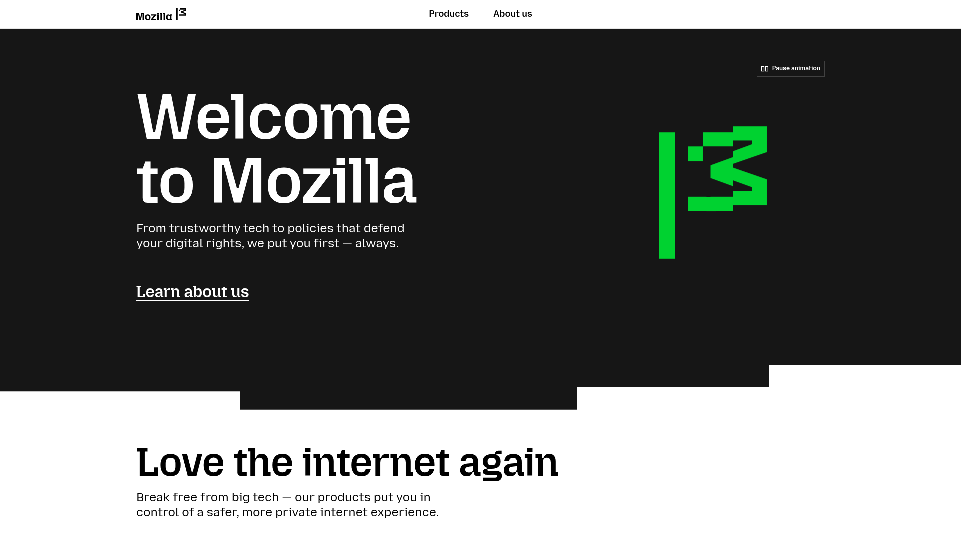
Hero section lacks a single, clear primary action. The page presents 'Learn about us' as the only above-fold CTA, but the page immediately pivots to product showcase and donation request. For a multi-product brand homepage, the routing between products, mission content, and donation is ambiguous—users must infer whether they should explore products, learn about Mozilla's mission, or donate.
- Majorfunctional
Focus & Hierarchy
The page contains at least 6 competing primary sections below the fold (product showcase, donation, AI mission, Mozilla Ventures, State of Mozilla, magazine), each with its own heading and CTA. This violates Hick's Law and creates decision paralysis. A visitor scrolling past the hero cannot easily determine which section is most important or which action Mozilla wants them to take next.
- Majorfunctional
Conversion Optimization
The donation CTA ('Donate to Mozilla Foundation') is presented as a full section with narrative copy, but lacks urgency, risk reversal, or specific benefit framing. The copy states 'Will you donate to Mozilla today?' but does not explain what the donation funds, what impact it creates, or provide a clear call-to-action button. The 'Donate' link is buried in body text rather than presented as a prominent button.
More UX reviews
Browse all →How does your site score?
Get the same layer-by-layer UX review for your homepage, pricing page, or product page.