Monday website UX review
A scan-backed analysis of how Monday performs across usability, visual clarity, and UX best practices. Use it as a reference for what to borrow, what to question, and what to test on your own site.
Sensei score: 76 out of 100
Aesthetic
80Practices
75How Monday looks
The verdict
A strong visual presentation undermined by navigation friction
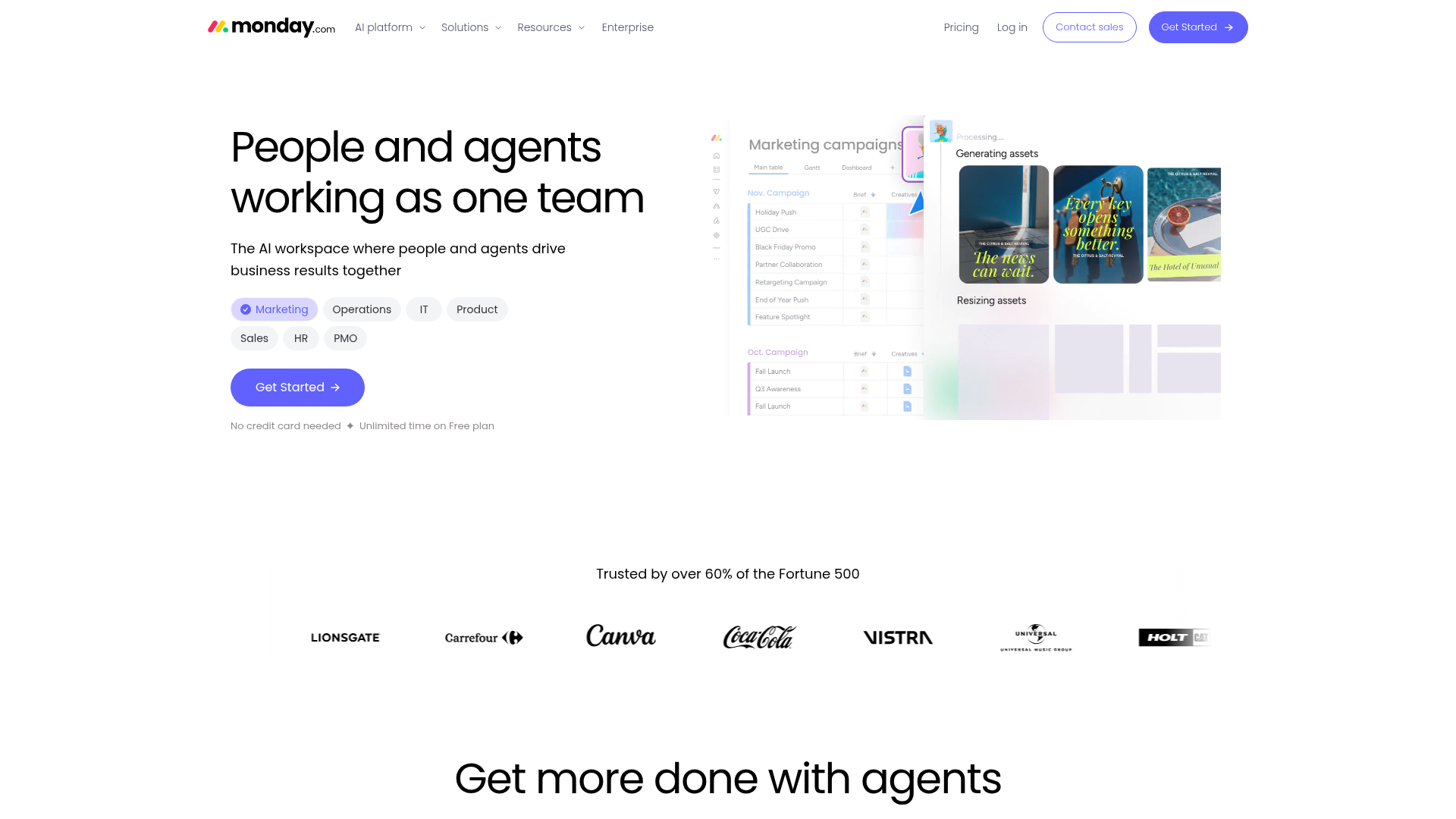
Monday's landing page scores 76/100 overall, with aesthetic design notably outperforming functional clarity. The 80-point aesthetic layer reflects confident visual hierarchy and polished presentation—the hero headline 'People and agents working as one team' is benefit-focused and direct. However, the functional score of 74 reveals a more fragmented experience beneath that surface. The core issue is structural: the page asks first-time visitors to choose a department (Marketing, Operations, IT, Product, Sales, HR, PMO) before they've fully understood what Monday does or why they should sign up. This early branching creates cognitive load at precisely the moment when clarity matters most. The subheading—'The AI workspace where people and agents drive business results together'—attempts to bridge that gap but lands as generic positioning rather than a compelling reason to proceed.
Observed UX signals
- Majorfunctional
Clarity
Hero headline 'People and agents working as one team' is benefit-focused and clear, but the subheading 'The AI workspace where people and agents drive business results together' is somewhat generic. The page then immediately branches into 7 department-specific use cases (Marketing, Operations, IT, Product, Sales, HR, PMO) without a clear primary conversion path, creating cognitive load for first-time visitors who must choose a department before understanding the core value.
- Majorfunctional
TrustCredibility
Social proof is present ('Trusted by over 60% of the Fortune 500') with recognizable logos (Lionsgate, Carrefour, Canva, Coca-Cola, Vistra, Universal, Holt), but this section appears mid-page after the hero and initial CTA. The claim lacks specificity—'60% of Fortune 500' is strong but unverified in the visible content. No customer testimonials with names, titles, or photos are visible in the hero or early sections to build immediate credibility.
- Majorfunctional
FocusHierarchy
The page presents multiple competing CTAs and navigation paths in the hero and early sections. The primary 'Get Started' button is present, but it competes with 7 department-specific links (Marketing, Operations, IT, Product, Sales, HR, PMO), each with its own agent preview. This violates Hick's Law—users must choose a department before committing to signup, adding friction to the conversion funnel.
More UX reviews
Browse all →How does your site score?
Get the same layer-by-layer UX review for your homepage, pricing page, or product page.