Moderntreasury website UX review
A scan-backed analysis of how Moderntreasury performs across usability, visual clarity, and UX best practices. Use it as a reference for what to borrow, what to question, and what to test on your own site.
Sensei score: 78 out of 100
Aesthetic
80Practices
78How Moderntreasury looks
The verdict
A capable landing page held back by conversion friction
Moderntreasury's landing page scores 78/100 overall—a solid result that masks meaningful gaps between what the page communicates and how effectively it converts. The aesthetic layer (80/100) performs strongest, suggesting the visual design and brand presentation are coherent and polished. The functional layer (77/100) reveals the real constraint: despite clear intent to drive conversions, the page introduces friction at multiple decision points. The practices score (78/100) sits between these two, indicating that while the page follows many UX conventions, it misses opportunities to apply them with precision. For a B2B SaaS landing page in fintech, where trust and clarity are prerequisites to conversion, these gaps warrant attention.
Observed UX signals
- Majorfunctional
Clarity
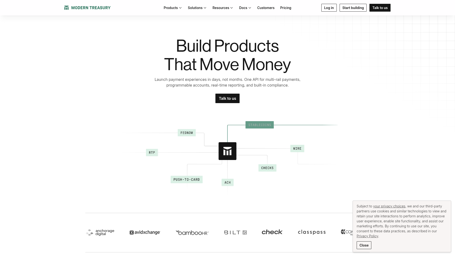
Primary value proposition mixes benefit and feature language. Hero headline 'Build Products That Move Money' is benefit-focused, but subheading 'Launch payment experiences in days, not months' is buried in body copy rather than prominently displayed as the core differentiator.
- Majorfunctional
TrustCredibility
Social proof is present (customer logos, testimonials, '$600 Billion Payments Processed' metric) but lacks specificity and context. The '$600 Billion' claim has no date, time period, or verification source visible. Testimonials include names and titles but no company logos or photos to increase authenticity.
- Majorfunctional
FocusHierarchy
Multiple competing CTAs above the fold create choice paralysis. Hero section offers 'Talk to us' button, but navigation header also displays 'Log in', 'Start building', and 'Talk to us' buttons. No clear visual hierarchy distinguishes the primary conversion path for new users.
More UX reviews
Browse all →How does your site score?
Get the same layer-by-layer UX review for your homepage, pricing page, or product page.
Scan your websiteSign in to run a fresh private scan