Miro website UX review
A scan-backed analysis of how Miro performs across usability, visual clarity, and UX best practices. Use it as a reference for what to borrow, what to question, and what to test on your own site.
Sensei score: 78 out of 100
Aesthetic
80Practices
75How Miro looks
The verdict
A strong visual and functional baseline with clarity gaps at the critical moment
Miro's landing page scores 78/100, anchored by solid aesthetic (80) and functional (79) execution but dragged down by practices (75). The page demonstrates competent design craft—visual hierarchy, component polish, and interactive elements are present—but the core messaging and conversion architecture undermine the work. The immediate problem isn't that the page looks or functions poorly; it's that visitors land on a page with 50+ links, competing focal points, and a value proposition that doesn't clearly answer why they should act now.
Observed UX signals
- Majorfunctional
Clarity
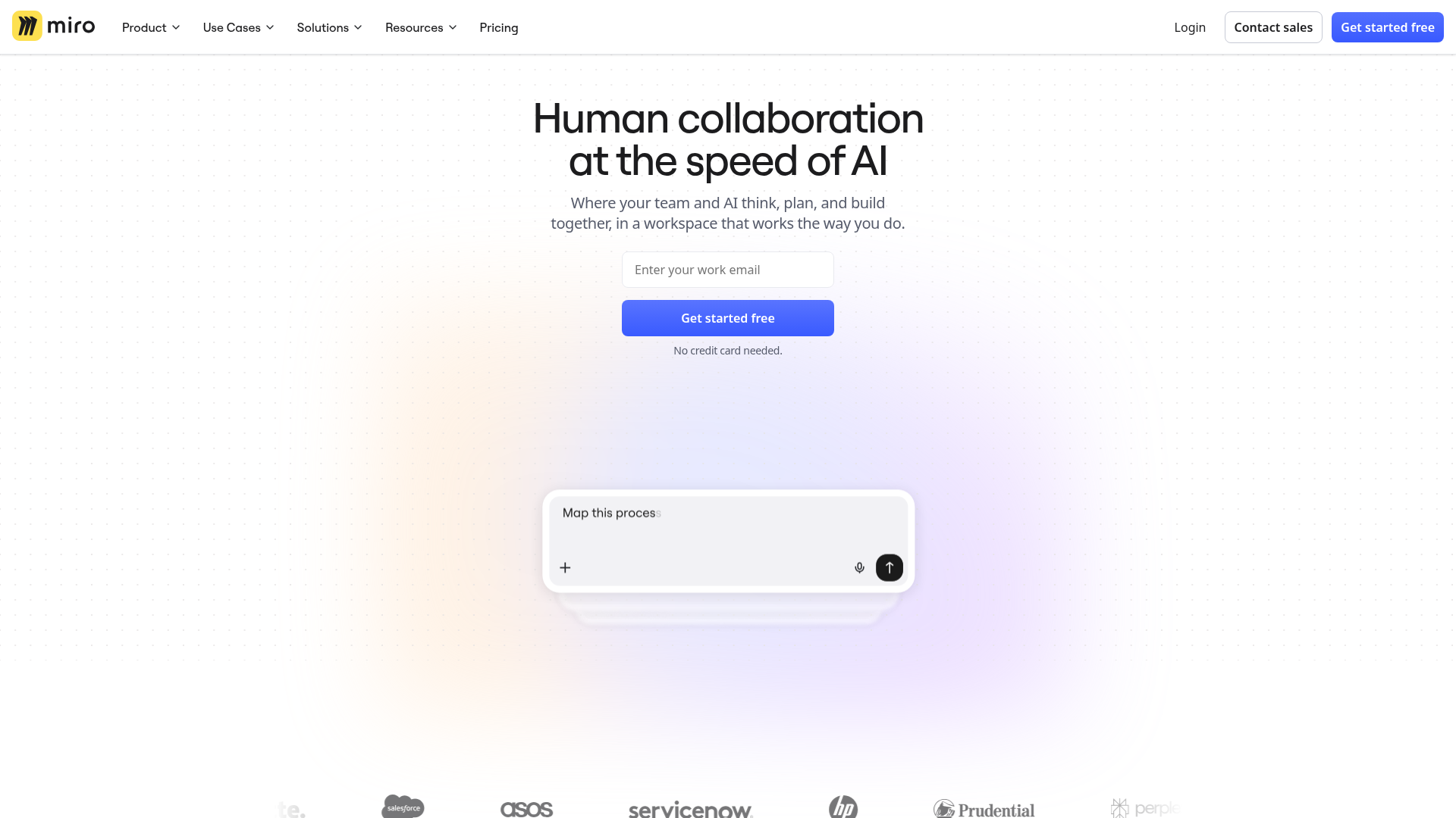
Hero value proposition is benefit-focused ('Human collaboration at the speed of AI') but the supporting subheading ('Where your team and AI think, plan, and build together, in a workspace that works the way you do') is vague and doesn't clearly explain the core outcome or differentiation. A visitor cannot immediately understand what problem Miro solves or why it's different from other collaboration tools.
- Majorfunctional
TrustCredibility
Social proof is present (100M+ people, 250+ apps, 6,000+ templates) and a customer testimonial from Lucy Starling at ASOS is included, but the testimonial lacks a photo or visual attribution beyond the name and title. The quote is generic ('most impactful initiatives will happen at the right time') and doesn't demonstrate a specific, measurable outcome that would build confidence in the product's value.
- Majorfunctional
ConversionOptimization
The primary CTA 'Get started free' is present and benefit-oriented, with risk reversal ('No credit card needed'), but the form field visible in the hero ('Enter your work email') lacks a visible label in the page data. Additionally, there are 50+ links on the page (navigation, feature links, 'Learn more' CTAs, pricing, templates, community, blog, academy), creating significant choice paralysis. A visitor cannot easily distinguish between the primary conversion path and secondary exploration paths.
More UX reviews
Browse all →How does your site score?
Get the same layer-by-layer UX review for your homepage, pricing page, or product page.