Midjourney website UX review
A scan-backed analysis of how Midjourney performs across usability, visual clarity, and UX best practices. Use it as a reference for what to borrow, what to question, and what to test on your own site.
Sensei score: 65 out of 100
Aesthetic
68Practices
70How Midjourney looks
The verdict
A 65/100 score masks a functional-aesthetic split
Midjourney's landing page scores 68 on aesthetic execution and 70 on design practices, but drops to 57 on functional clarity—a 13-point gap that signals a coherent visual identity undermined by unclear messaging and conversion friction. The page presents itself as a polished, mission-driven brand, but visitors cannot quickly determine what the product does or why they should sign up. This is not a design system problem or a visual polish problem; it is a structural problem in how the page prioritizes information and action.
Observed UX signals
- Criticalfunctional
Clarity
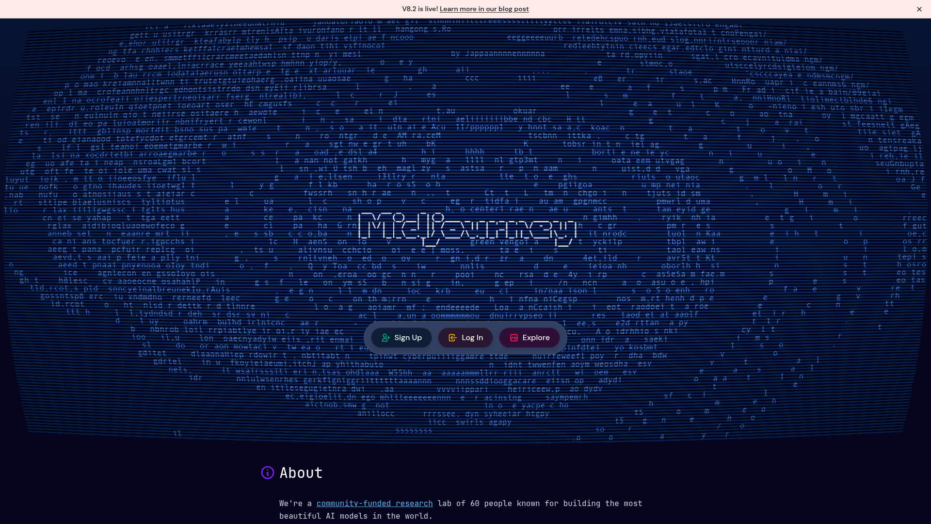
The page lacks a clear primary value proposition above the fold. The hero section leads with 'About' and a philosophical statement ('We're a community-funded research lab of 60 people known for building the most beautiful AI models in the world') rather than explaining what Midjourney does or why a visitor should care. A first-time visitor cannot quickly understand the core product or its benefit.
- Criticalfunctional
ConversionOptimization
The primary CTA copy is generic and benefit-agnostic. 'Sign Up', 'Log In', and 'Explore' buttons appear multiple times without context about what action leads to what outcome. There is no risk reversal, urgency, or benefit-oriented microcopy to reduce friction. A visitor does not know what happens after clicking 'Sign Up' or why they should.
- Majorfunctional
FocusHierarchy
The page presents multiple competing CTAs (Sign Up, Log In, Explore) with no clear visual or functional hierarchy. The 'About' heading and philosophical mission statement dominate the hero, pushing product-focused messaging and action below the fold. Navigation and secondary links (Documentation, Discord, help page) are equally prominent, creating distraction from conversion.
More UX reviews
Browse all →How does your site score?
Get the same layer-by-layer UX review for your homepage, pricing page, or product page.