Magiceden website UX review
A scan-backed analysis of how Magiceden performs across usability, visual clarity, and UX best practices. Use it as a reference for what to borrow, what to question, and what to test on your own site.
Sensei score: 67 out of 100
Aesthetic
65Practices
63How Magiceden looks
The verdict
A marketplace caught between feature announcement and user benefit
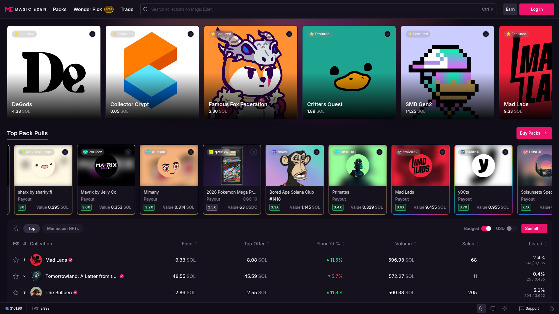
Magic Eden's landing page scores 67/100 overall—a mixed result that reflects genuine tension between functional clarity and aesthetic presentation. The Functional layer (71) outperforms Aesthetic (65) and Practices (63), suggesting the page does communicate *what* the site is, but struggles to explain *why* a visitor should act, and presents too many competing reasons to do so simultaneously.
Observed UX signals
- Majorfunctional
Clarity
Page purpose is identifiable but value proposition is weak. The hero section leads with 'Solana NFT Marketplace' (feature) rather than a benefit-oriented statement. For a visitor unfamiliar with NFTs or Magic Eden, the immediate value is unclear—why should they use this marketplace over competitors?
- Majorfunctional
FocusHierarchy
Multiple competing CTAs and navigation paths create choice paralysis. Above the fold: 'Log In', 'Buy Packs', 'See all', plus primary navigation (Packs, Wonder Pick, Trade, Earn). The page does not establish a single primary conversion goal—it treats all actions as equally important.
- Majorfunctional
ConversionOptimization
CTA copy is generic and lacks benefit framing. 'Buy Packs' and 'See all' do not communicate outcome or urgency. No risk reversal, guarantee, or scarcity messaging is visible. Forms or signup flows are not shown, but the page does not address common objections (fees, security, ease of use).
More UX reviews
Browse all →How does your site score?
Get the same layer-by-layer UX review for your homepage, pricing page, or product page.