Lumalabs website UX review
A scan-backed analysis of how Lumalabs performs across usability, visual clarity, and UX best practices. Use it as a reference for what to borrow, what to question, and what to test on your own site.
Sensei score: 78 out of 100
Aesthetic
80Practices
79How Lumalabs looks
The verdict
A 78-point landing with clarity as the limiting factor
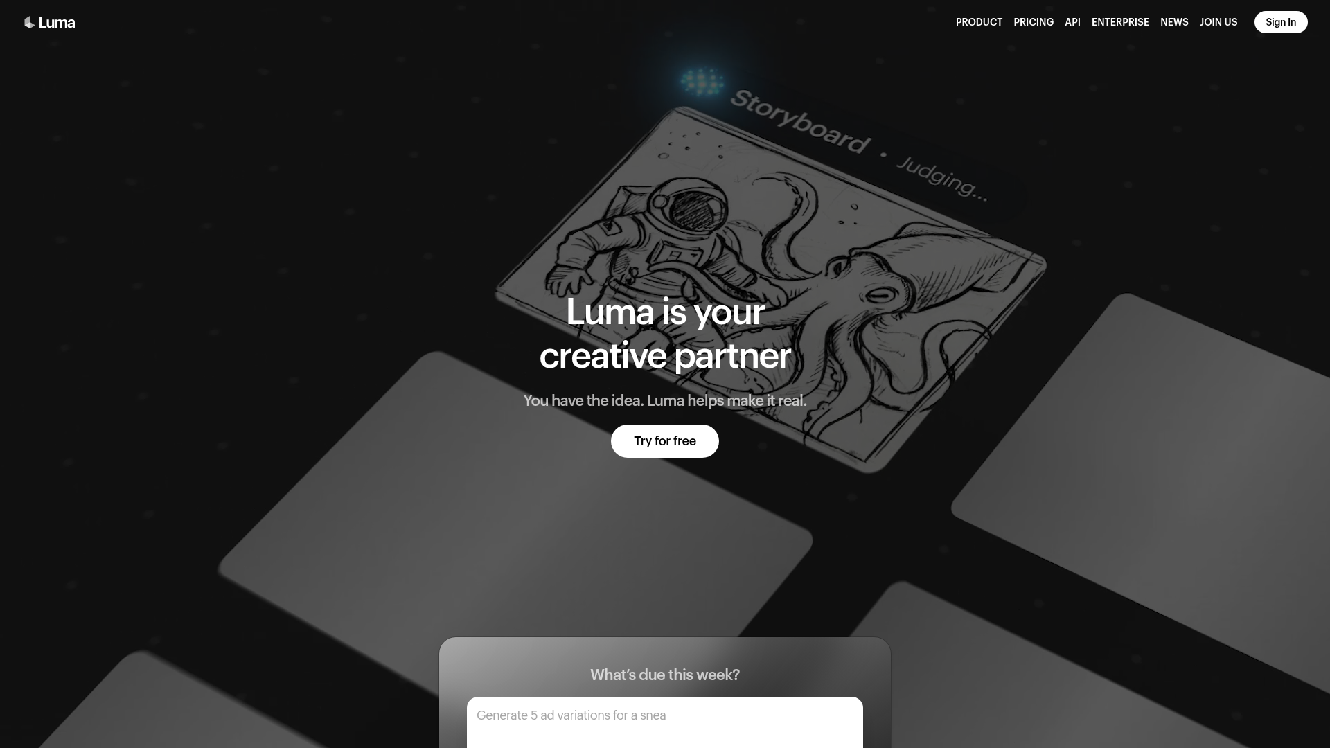
Lumalabs scores 78/100 overall—a solid result that masks a critical functional weakness. The aesthetic layer (80) and practices layer (79) both outperform the functional layer (75), suggesting the page looks and behaves well from a technical and visual standpoint, but fails to communicate its core value clearly. This inversion is diagnostic: the site has invested in polish and structure, but not in the foundational work of explaining what Luma does or why someone should care. For a landing page, this is a significant liability. Visitors arrive with no context; the page must immediately answer what problem Luma solves and why it matters. Instead, it leads with 'creative partner'—a phrase that could describe a design tool, a video editor, a copywriting assistant, or an AI service. The subheading 'You have the idea. Luma helps make it real' compounds the vagueness. Without clarity on the product's actual function, even strong aesthetic execution cannot drive conversion.
Observed UX signals
- Majorfunctional
Clarity
Hero value proposition relies on abstract benefit language ('creative partner') without immediately explaining what Luma does or what problem it solves. The subheading 'You have the idea. Luma helps make it real.' is vague—'make it real' could mean anything from design to video to copywriting.
- Majorfunctional
Trust & Credibility
Social proof (client logos: Serviceplan, Dentsu, Humain, Aperture, Publicis Groupe, Boundless, Mazda, Uncharted) is present but lacks quantitative credibility signals. No user count, case study metrics, or specific outcome claims (e.g., 'trusted by 5,000+ creative teams' or 'generates 10M+ assets monthly') are visible above the fold.
- Majorfunctional
Focus & Hierarchy
Multiple competing CTAs above the fold create choice paralysis: 'Try for free' (primary), 'Try Free' (repeated), 'Learn more' (secondary), and a modal prompt 'What's due this week?' with placeholder text 'Generate 5 ad variations for a sneaker cat...' The modal appears to be a feature demo but functions as a distraction from the primary conversion goal.
More UX reviews
Browse all →How does your site score?
Get the same layer-by-layer UX review for your homepage, pricing page, or product page.