Lovable website UX review
A scan-backed analysis of how Lovable performs across usability, visual clarity, and UX best practices. Use it as a reference for what to borrow, what to question, and what to test on your own site.
Sensei score: 79 out of 100
Aesthetic
81Practices
77How Lovable looks
The verdict
A solid landing with misaligned conversion signals
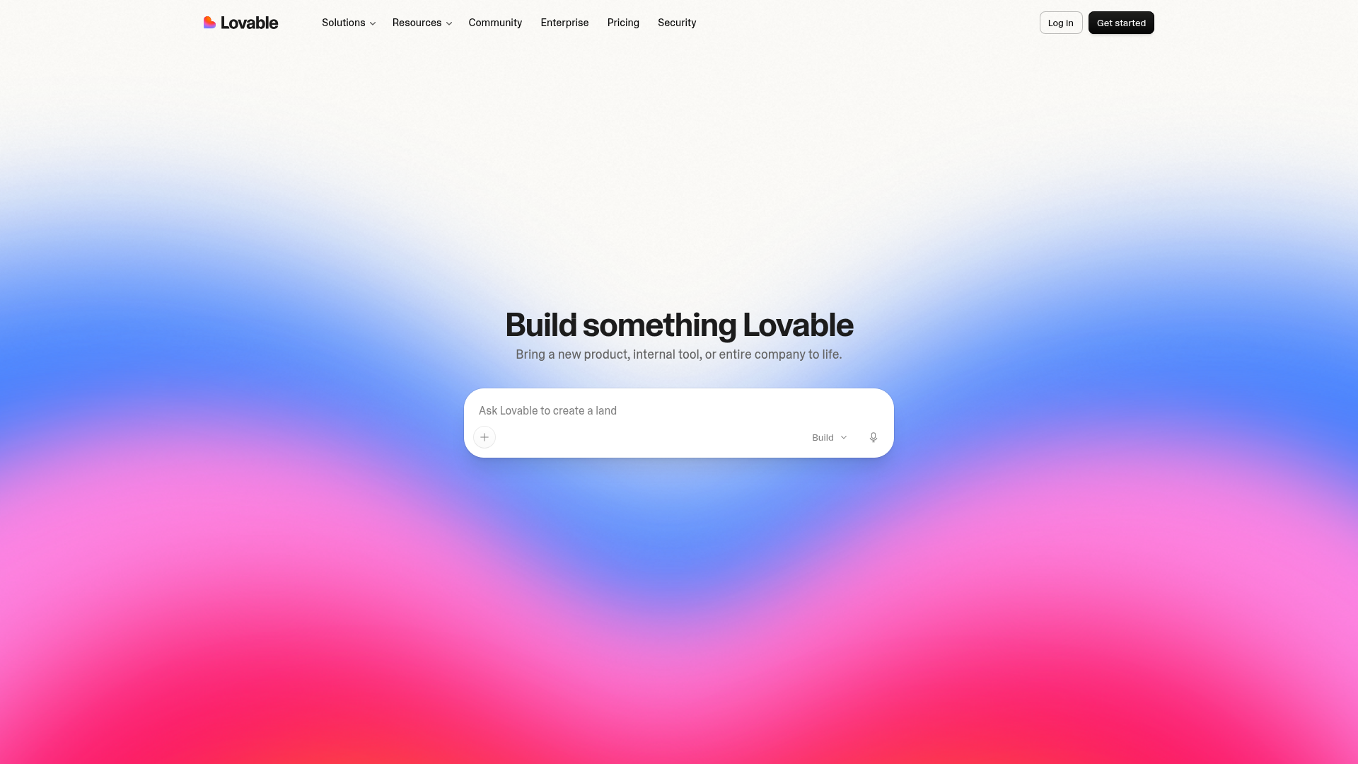
Lovable's landing page scores 79/100 overall—a strong result that masks a specific structural problem. The aesthetic and functional layers both score in the low 80s, suggesting the page is visually competent and technically sound. The practices layer (77) dips lower, signaling that the page's *organization* doesn't yet match its polish. The core issue is not broken design but conflicting priorities: the page looks confident and moves users through the experience, yet it doesn't clearly signal what action matters most or why they should take it now.
Observed UX signals
- Majorfunctional
Clarity
Primary value proposition relies on abstract brand language ('Build something Lovable') rather than concrete outcome. Subheading 'Bring a new product, internal tool, or entire company to life' is benefit-oriented but buried after the brand statement. Users must infer the core job (AI-powered app building) from secondary copy.
- Majorfunctional
ConversionOptimization
Primary CTA copy is generic ('Get started') and appears twice above the fold without differentiation. The hero input field ('Ask Lovable to create a blog about...') is a secondary interaction that may distract from the primary signup flow. No risk reversal, urgency, or benefit-oriented microcopy present near the CTA.
- Majorfunctional
FocusHierarchy
Multiple competing interactive elements in the hero: primary 'Get started' CTA, secondary input field with 'Build' dropdown, and 'Log in' link in the top nav. The input field is visually prominent and may pull attention from the primary conversion goal (signup). Navigation menu (Solutions, Resources, Community, Enterprise, Pricing, Security) adds additional choice points above the fold.
More UX reviews
Browse all →How does your site score?
Get the same layer-by-layer UX review for your homepage, pricing page, or product page.