Ledger website UX review
A scan-backed analysis of how Ledger performs across usability, visual clarity, and UX best practices. Use it as a reference for what to borrow, what to question, and what to test on your own site.
Sensei score: 76 out of 100
Aesthetic
79Practices
72How Ledger looks
The verdict
A security product caught between education and conversion
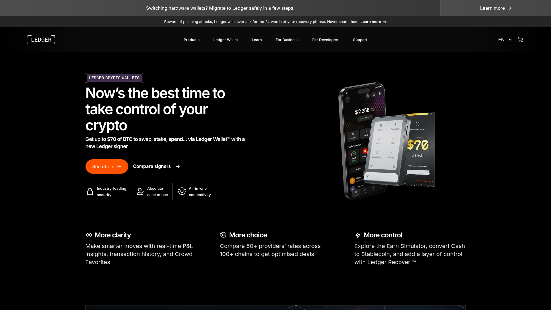
Ledger's landing page scores 76/100 overall—a solid result that masks a fundamental tension. The aesthetic layer (79) and functional layer (76) are nearly aligned, but practices (72) lag noticeably, signaling that the page knows how to look and behave well in isolation, yet struggles to guide users toward a decision. For a hardware wallet company, where trust is the primary currency, this gap matters. The page presents four distinct product lines with individual learning paths, a comparison tool, and a promotional offer, but fails to establish why a visitor should trust Ledger with their assets before asking them to choose between these options.
Observed UX signals
- Majorfunctional
Trust & Credibility
No visible social proof, user counts, or testimonials above the fold. The page shows product ratings (4.5/5, 4.3/5, 4/5) for individual devices but lacks aggregate trust signals like 'X million users', customer testimonials with names/photos, or press mentions that would establish credibility for a security-critical product.
- Majorfunctional
Focus & Hierarchy
Multiple competing primary CTAs above the fold create choice paralysis. 'See offers' (orange button) and 'Compare signers' (secondary link) are both prominent in the hero, followed by three distinct product pathways (Stax, Flex, Nano Gen5, Nano Classics) with individual 'Learn more' links. Users must decide between comparing, shopping, or learning about specific devices.
- Majorfunctional
Conversion Optimization
Primary CTA copy is generic and benefit-light. 'See offers' does not communicate what the user will gain (e.g., discount amount, free trial, or specific product benefit). The subheading mentions 'Get up to $70 of BTC to swap, stake, spend... via Ledger Wallet™ with a new Ledger signer' but this incentive is buried in body text, not in the CTA itself.
More UX reviews
Browse all →How does your site score?
Get the same layer-by-layer UX review for your homepage, pricing page, or product page.