Klarna website UX review
A scan-backed analysis of how Klarna performs across usability, visual clarity, and UX best practices. Use it as a reference for what to borrow, what to question, and what to test on your own site.
Sensei score: 74 out of 100
Aesthetic
72Practices
72How Klarna looks
The verdict
A solid performer with a focus problem
Klarna's landing page scores 74/100 overall—a strong result that masks a critical structural issue. The Functional layer (77) and Aesthetic layer (72) both land above 70, suggesting the page has visual coherence and technical soundness. But the score obscures a pattern: the page asks visitors to make too many choices at once, and the choices themselves lack clarity about what Klarna actually does or why it matters. The Practices layer (72) reflects this tension—the page follows conventions well enough, but violates one of the most basic ones: guiding users toward a single, clear action.
Observed UX signals
- Majorfunctional
Focus & Hierarchy
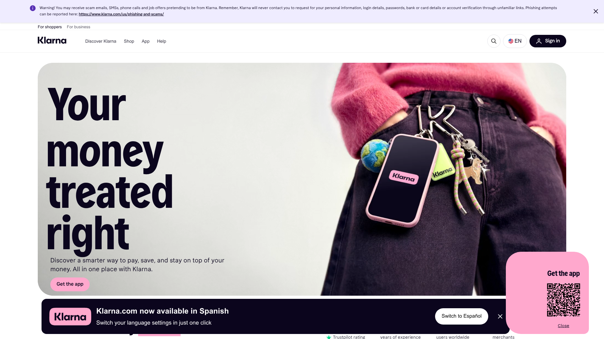
Multiple competing primary CTAs above the fold create choice paralysis. 'Get the app' appears twice in the hero section, while 'Sign up now' for membership deals is repeated 4 times across the visible area. This violates Hick's Law and dilutes conversion focus.
- Majorfunctional
Conversion Optimization
CTA copy is generic and lacks benefit orientation. 'Get the app', 'Sign up now', 'Learn more', and 'Explore' do not communicate the outcome or value. Users must infer why they should take action.
- Majorfunctional
Clarity
Hero headline 'Your money treated right' is benefit-focused but abstract. The subheading 'Discover a smarter way to pay, save, and stay on top of your money. All in one place with Klarna' lists features (pay, save, manage) rather than clarifying the core job. A first-time visitor may not immediately understand what Klarna does or why it's different.
More UX reviews
Browse all →How does your site score?
Get the same layer-by-layer UX review for your homepage, pricing page, or product page.
Scan your websiteSign in to run a fresh private scan