Justworks website UX review
A scan-backed analysis of how Justworks performs across usability, visual clarity, and UX best practices. Use it as a reference for what to borrow, what to question, and what to test on your own site.
Sensei score: 77 out of 100
Aesthetic
80Practices
77How Justworks looks
The verdict
A capable platform page held back by conversion friction
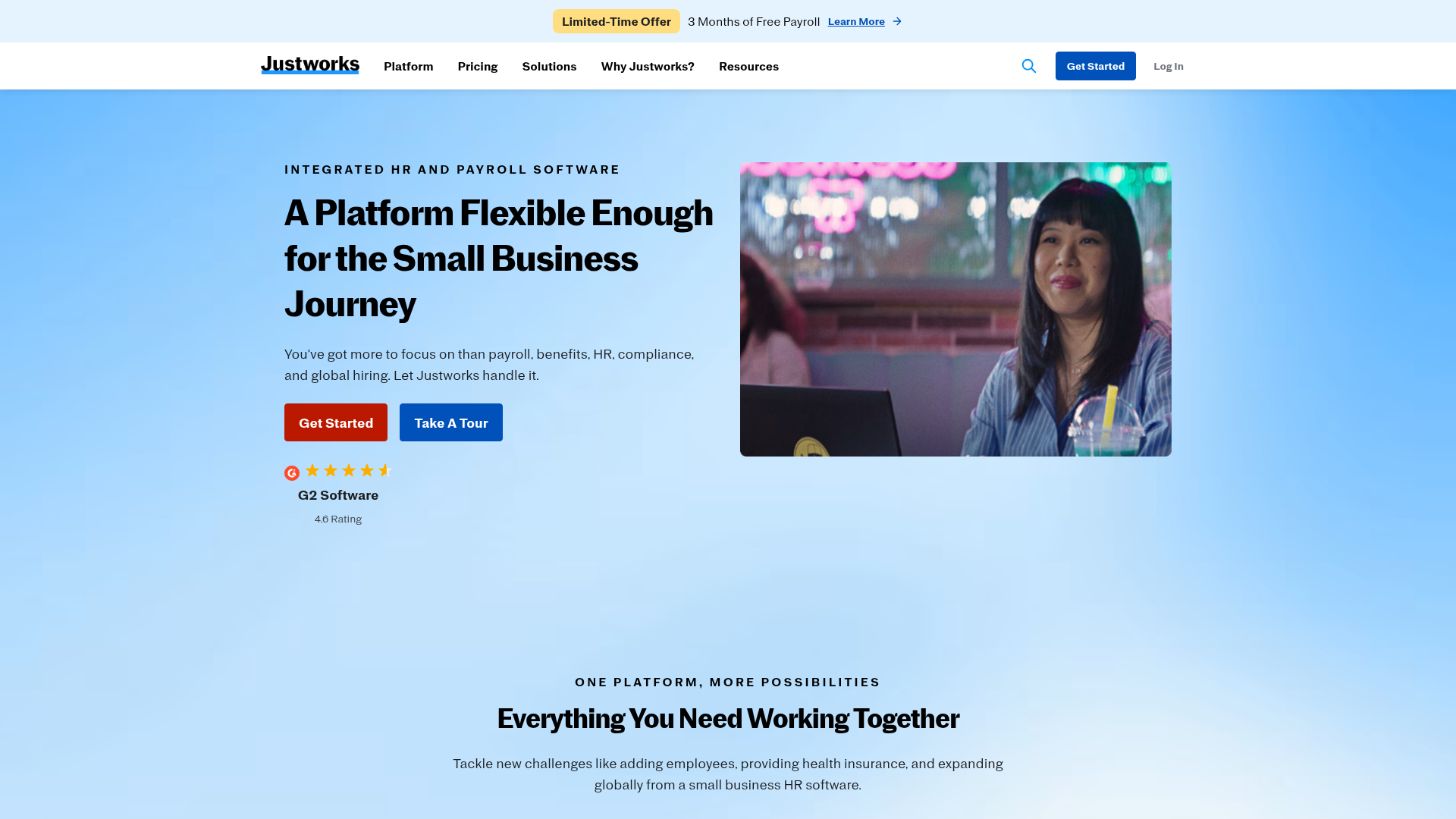
Justworks' landing page scores 77/100—a solid result that reflects genuine strengths in visual design and structural practices, but masks a functional layer (74) that introduces unnecessary friction at the moment of decision. The page communicates the *existence* of a multi-feature platform effectively, but struggles to guide visitors toward a single, confident next step. The gap between aesthetic confidence (80) and functional clarity (74) suggests the page looks trustworthy without yet feeling decisive about what it wants visitors to do.
Observed UX signals
- Majorfunctional
Clarity
Hero headline 'A Platform Flexible Enough for the Small Business Journey' is benefit-adjacent but abstract. It doesn't immediately communicate what problem Justworks solves or what outcome the user gains. The supporting subhead 'You've got more to focus on than payroll, benefits, HR, compliance, and global hiring. Let Justworks handle it.' is stronger but buried below the primary headline.
- Majorfunctional
Conversion Optimization
Primary CTA 'Get Started' lacks benefit-oriented copy and risk-reversal language. No visible indication of what happens next (e.g., 'Start Free Trial,' 'No Credit Card Required,' 'See Demo in 2 Minutes'). The secondary 'Take A Tour' competes for attention without clear differentiation in value.
- Majorfunctional
Focus & Hierarchy
Four equally prominent 'Explore [Feature]' buttons (Explore Payroll, Explore Benefits, Explore Compliance, Explore Going Global) create decision paralysis and dilute focus from the primary conversion goal. Each button is a competing CTA that pulls attention away from 'Get Started.'
More UX reviews
Browse all →How does your site score?
Get the same layer-by-layer UX review for your homepage, pricing page, or product page.