Hims website UX review
A scan-backed analysis of how Hims performs across usability, visual clarity, and UX best practices. Use it as a reference for what to borrow, what to question, and what to test on your own site.
Sensei score: 70 out of 100
Aesthetic
71Practices
68How Hims looks
The verdict
A high-scoring page undermined by conversion friction
Hims lands at 70/100 on the Sensei benchmark—a strong score that reflects solid execution across functional, aesthetic, and practice layers (71, 71, and 68 respectively). The page demonstrates visual polish and reasonable structural discipline. However, the score masks a critical problem: the landing experience prioritizes breadth of product offerings over conversion clarity. The result is a page that looks competent but creates decision paralysis at the moment when clarity matters most—when a visitor decides whether to commit to the weight-loss program, which appears to be the primary conversion goal.
Observed UX signals
- Majorfunctional
Clarity
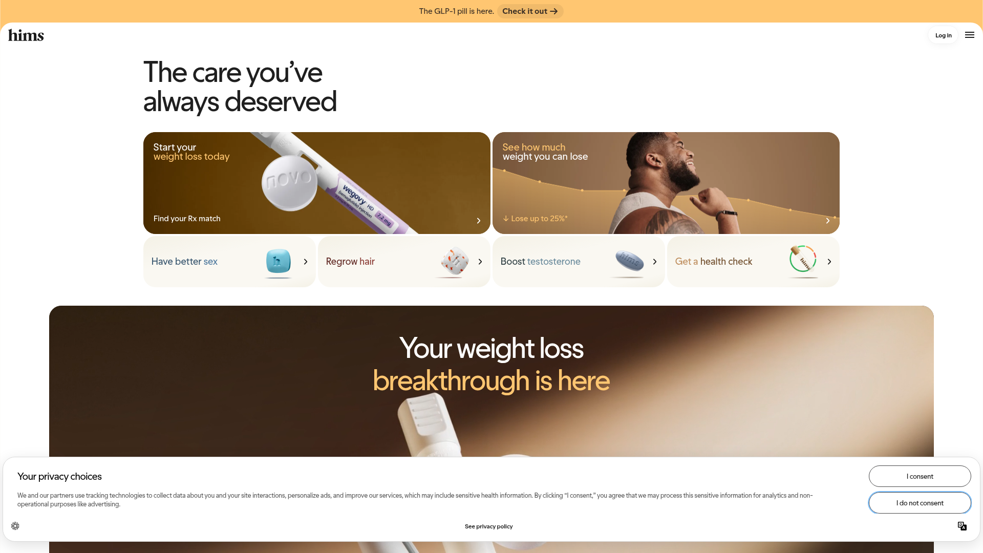
Hero headline 'The care you've always deserved' is benefit-adjacent but vague—it doesn't immediately communicate what Hims does or which health condition to address first. Visitors must scroll or infer from subheadings that weight loss is the primary focus.
- Majorfunctional
Focus & Hierarchy
Four competing primary CTAs appear above the fold: 'Start your weight loss today' (with 'Find your Rx match' link), 'See how much weight you can lose,' and four horizontal product cards ('Have better sex,' 'Regrow hair,' 'Boost testosterone,' 'Get a health check'). This violates Hick's Law and creates decision paralysis.
- Majorfunctional
Trust & Credibility
Testimonials are present (Paul, Brandon, Jonathan, Remington) but lack visual credibility markers: no photos, no company/title context, and a disclaimer ('Paid testimonial. Results have not been independently verified') undermines trust. No social proof (user count, ratings, press logos) is visible above the fold.
More UX reviews
Browse all →How does your site score?
Get the same layer-by-layer UX review for your homepage, pricing page, or product page.