Highbeam website UX review
A scan-backed analysis of how Highbeam performs across usability, visual clarity, and UX best practices. Use it as a reference for what to borrow, what to question, and what to test on your own site.
Sensei score: 77 out of 100
Aesthetic
80Practices
74How Highbeam looks
The verdict
A strong aesthetic foundation with functional friction at conversion
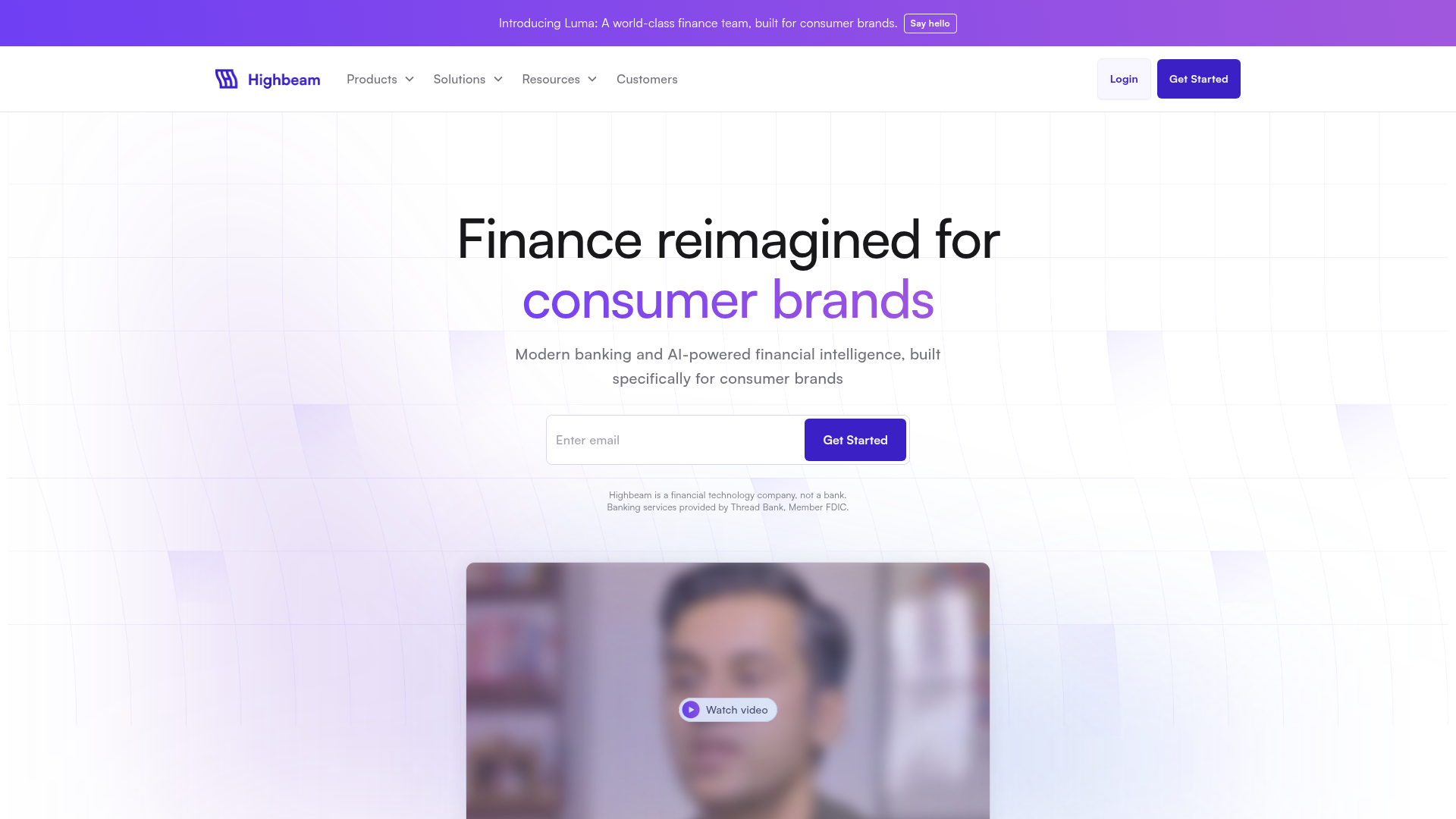
Highbeam's landing page scores 77/100 overall, with aesthetic execution (80) outpacing functional clarity (76) and practice adherence (74). The gap suggests a page that *looks* polished but asks too much of visitors before they understand what to do or why. For a fintech landing targeting consumer brands, this mismatch is diagnostic: visual confidence alone does not compensate for unclear value propositions or competing calls to action.
Observed UX signals
- Majorfunctional
Clarity
Hero headline 'Finance reimagined for consumer brands' is benefit-adjacent but vague about the specific transformation. Subheading clarifies with 'Modern banking and AI-powered financial intelligence,' but the primary value (what problem it solves) requires inference.
- Majorfunctional
Conversion Optimization
Primary CTA 'Get Started' appears twice above the fold (in hero form and navigation) but lacks benefit-oriented copy. Generic 'Get Started' does not communicate what the user gains (e.g., 'Start Free Account,' 'Qualify for Capital,' 'See Your Savings').
- Majorfunctional
Focus & Hierarchy
Navigation menu includes 'Products' (dropdown), 'Solutions' (dropdown), 'Resources' (dropdown), and 'Customers' (link), creating four competing top-level choices. On a conversion-focused hero, this navigation density pulls attention from the primary CTA and value proposition.
More UX reviews
Browse all →How does your site score?
Get the same layer-by-layer UX review for your homepage, pricing page, or product page.