Headspace website UX review
A scan-backed analysis of how Headspace performs across usability, visual clarity, and UX best practices. Use it as a reference for what to borrow, what to question, and what to test on your own site.
Sensei score: 74 out of 100
Aesthetic
79Practices
74How Headspace looks
The verdict
A strong visual foundation undermined by unclear messaging
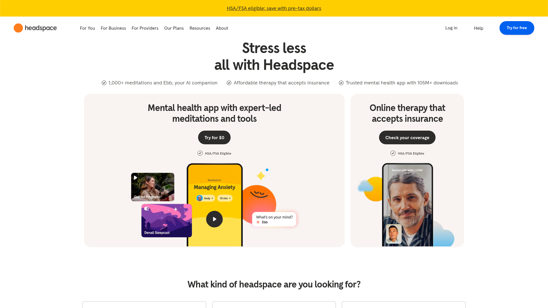
Headspace's landing page scores 74/100—a solid result that masks a critical tension between what the page looks like and what it asks users to do. The aesthetic layer (79/100) performs well, suggesting the visual design, typography, and layout create confidence. But the functional layer (70/100) reveals a page that overwhelms rather than guides. The gap between these scores is diagnostic: Headspace has invested in presentation, but the core job of converting a visitor into a trial user remains muddled. This is not a design system failure or a visual hierarchy problem—it's a messaging and decision architecture problem that no amount of polish can fix.
Observed UX signals
- Majorfunctional
Clarity
Hero headline 'Stress less all with Headspace' is incomplete and grammatically awkward. The phrase 'all with Headspace' lacks clarity about what the product does or why someone should care. The three supporting claims below (1,000+ meditations, affordable therapy, 105M+ downloads) are benefits but don't form a cohesive value proposition.
- Majorfunctional
Focus & Hierarchy
The page presents six competing primary CTAs above the fold: 'Try for $0' (meditation), 'Check your coverage' (therapy), and a segmentation question 'What kind of headspace are you looking for?' with six sub-options (Stress less, Sleep soundly, Manage anxiety, Process thoughts, Practice meditation, Start therapy). This violates Hick's Law and creates decision paralysis rather than guiding users toward a single conversion path.
- Majorfunctional
Conversion Optimization
The 'Try for $0' CTA lacks risk-reversal language. It does not communicate the trial length, cancellation policy, or what happens after the trial. Users cannot determine if they're committing to a paid subscription or if there's a genuine no-risk entry point. The page mentions 'HSA/FSA Eligible' but does not explain why this matters or how it reduces friction.
More UX reviews
Browse all →How does your site score?
Get the same layer-by-layer UX review for your homepage, pricing page, or product page.