Gusto website UX review
A scan-backed analysis of how Gusto performs across usability, visual clarity, and UX best practices. Use it as a reference for what to borrow, what to question, and what to test on your own site.
Sensei score: 77 out of 100
Aesthetic
75Practices
75How Gusto looks
The verdict
A solid performer undermined by conversion friction
Gusto's landing page scores 77/100 overall—a strong result that reflects competent execution across functional, aesthetic, and practice layers. The Functional layer leads at 81, suggesting the page mechanics are sound: navigation works, content loads, interactive elements respond as expected. Yet this functional strength masks a critical strategic problem. The page presents visitors with competing priorities before they understand what they're signing up for, and the primary conversion action lacks the persuasive detail needed to overcome signup hesitation. The gap between the Functional score (81) and the lower Aesthetic and Practices scores (both 75) signals that the core issue isn't broken design—it's misaligned hierarchy and messaging that creates unnecessary friction at the moment of decision.
Observed UX signals
- Majorfunctional
Focus & Hierarchy
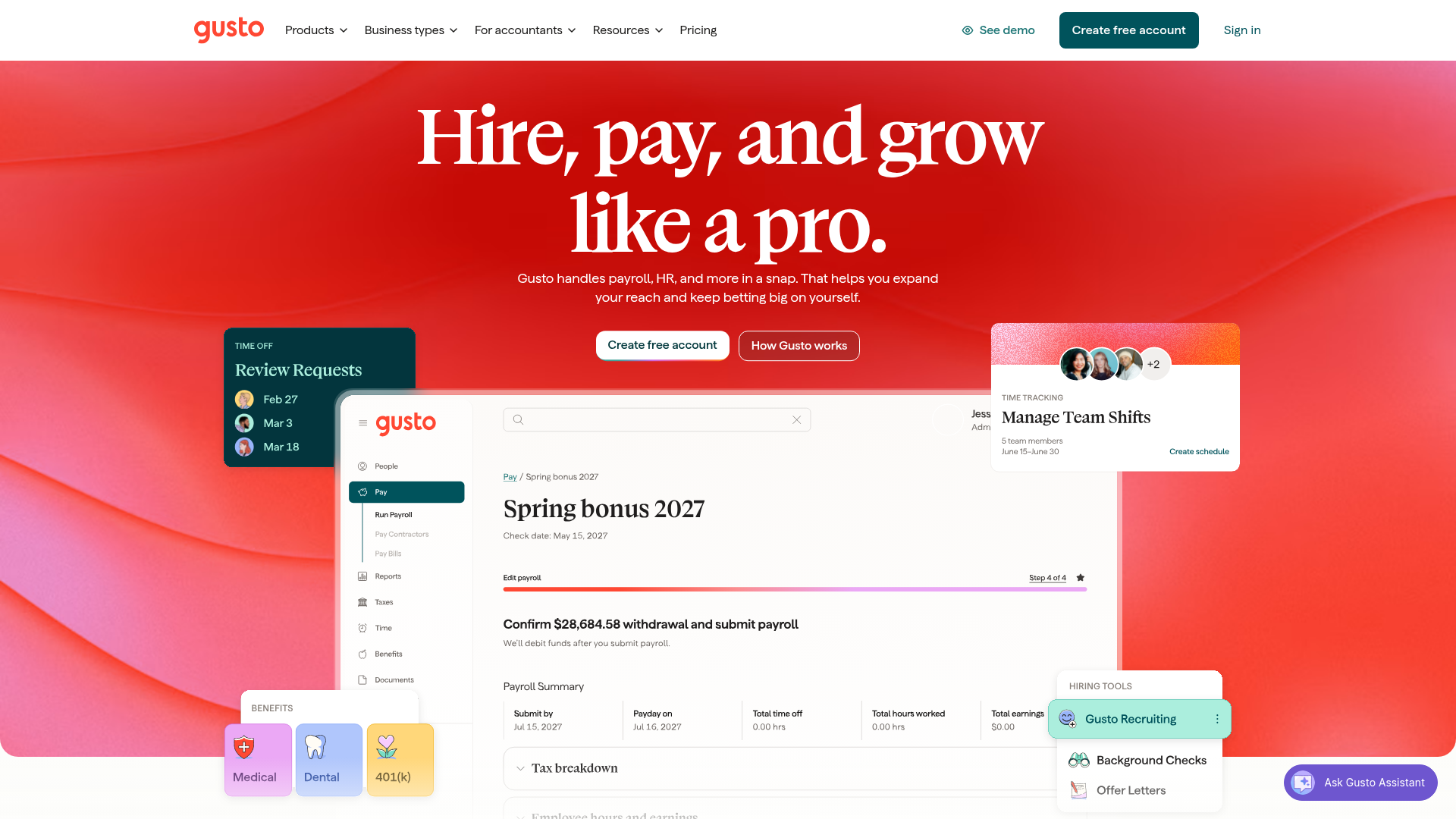
Multiple competing primary CTAs above the fold create choice paralysis. Hero section presents both 'Create free account' and 'How Gusto works' as equally prominent actions, with no clear visual or hierarchical distinction between them.
- Majorfunctional
Conversion Optimization
Primary CTA copy lacks benefit orientation and risk reversal. 'Create free account' is generic and does not communicate what users gain or address signup friction (e.g., no mention of free trial duration, no credit card required, or money-back guarantee).
- Majorfunctional
Focus & Hierarchy
Feature-driven section hierarchy dilutes the primary conversion goal. The page presents four equally weighted feature modules ('Run payroll in five minutes flat,' 'Track team time in no time,' 'Every solopreneur deserves support,' 'Hiring tools') without clear prioritization or guidance on which is most relevant to the visitor.
More UX reviews
Browse all →How does your site score?
Get the same layer-by-layer UX review for your homepage, pricing page, or product page.