Groq website UX review
A scan-backed analysis of how Groq performs across usability, visual clarity, and UX best practices. Use it as a reference for what to borrow, what to question, and what to test on your own site.
Sensei score: 69 out of 100
Aesthetic
76Practices
69How Groq looks
The verdict
A landing page caught between visual polish and structural confusion
Groq's homepage scores 69/100 on Sensei, a split verdict that reflects a common pattern in B2B infrastructure marketing: aesthetic confidence without functional clarity. The Aesthetic layer (76/100) outpaces Functional (63/100) by 13 points, suggesting the page looks intentional and polished but fails to guide visitors through basic comprehension. For a company selling AI inference infrastructure to developers, this gap is diagnostic. A first-time visitor—whether a developer evaluating tools or a decision-maker researching vendors—encounters jargon ('neocloud', 'LPU') without explanation, compounded by structural invisibility that breaks both usability and SEO. The Practices score (69/100) sits between these layers, indicating inconsistent application of UX standards across the page.
Observed UX signals
- Criticalfunctional
Clarity
No semantic headings detected on the page. The hero section relies entirely on body text ('Groq is the premier neocloud for fast inference') without an H1 tag, making the primary value proposition invisible to screen readers and search engines. The page content flows as a continuous paragraph without structural hierarchy.
- Majorfunctional
Clarity
The term 'neocloud' and 'LPU' are unexplained jargon. A first-time visitor cannot understand what Groq does or why it matters within 5 seconds. The page assumes deep familiarity with AI infrastructure terminology without providing context or benefit translation.
- Majorfunctional
focusHierarchy
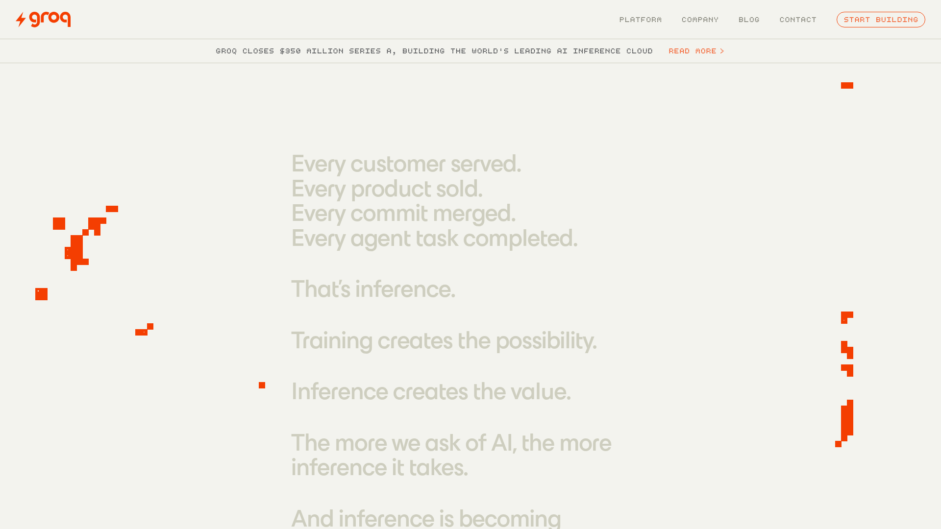
Multiple competing CTAs ('Start building' appears 3 times, 'Contact' appears 3 times, 'Read more>' for news) with no visual hierarchy differentiation. The page lacks a single, obvious primary conversion goal. News announcement ('Groq Closes $350 million Series A') is positioned prominently in the hero, competing with the core value proposition.
More UX reviews
Browse all →How does your site score?
Get the same layer-by-layer UX review for your homepage, pricing page, or product page.