Glean website UX review
A scan-backed analysis of how Glean performs across usability, visual clarity, and UX best practices. Use it as a reference for what to borrow, what to question, and what to test on your own site.
Sensei score: 73 out of 100
Aesthetic
79Practices
68How Glean looks
The verdict
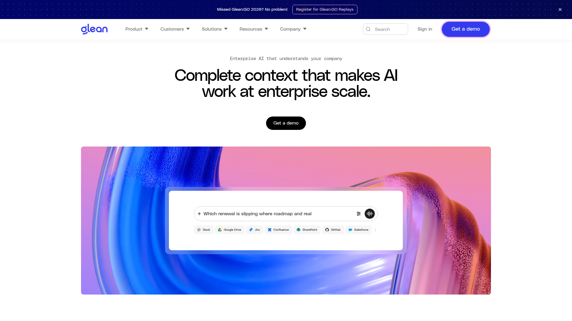
A visually confident page undermined by messaging clarity
Glean's landing page scores 73/100—a solid result that masks a structural tension between how the page looks and what it asks visitors to do. The aesthetic layer (79/100) is the strongest performer, suggesting the visual design, typography, and layout choices are working. But that confidence evaporates when users try to understand the core value proposition or decide whether to engage. The functional layer (70/100) and practices layer (68/100) reveal why: the page asks too much of visitors without giving them enough reason to comply.
Observed UX signals
- Majorfunctional
Clarity
Primary value proposition relies on abstract enterprise language ('Complete context that makes AI work at enterprise scale') without clearly stating what problem Glean solves or what outcome users achieve. The hero headline is feature-focused rather than benefit-focused.
- Majorfunctional
focusHierarchy
Multiple competing CTAs ('Get a demo' appears 8+ times in the data; 'Sign in' appears 6+ times) create choice paralysis and dilute conversion focus. The page also presents a complex navigation menu with 50+ links across Product, Customers, Solutions, Resources, and Company sections, pulling attention from the primary conversion goal.
- Majorfunctional
conversionOptimization
CTA copy is generic ('Get a demo') without benefit-oriented language or risk reversal. No visible urgency, guarantee, or objection-handling near the primary CTA. The page does not communicate what happens after clicking 'Get a demo' or how long the process takes.
More UX reviews
Browse all →How does your site score?
Get the same layer-by-layer UX review for your homepage, pricing page, or product page.