Freshworks website UX review
A scan-backed analysis of how Freshworks performs across usability, visual clarity, and UX best practices. Use it as a reference for what to borrow, what to question, and what to test on your own site.
Sensei score: 78 out of 100
Aesthetic
81Practices
78How Freshworks looks
The verdict
A solid performer held back by conversion friction
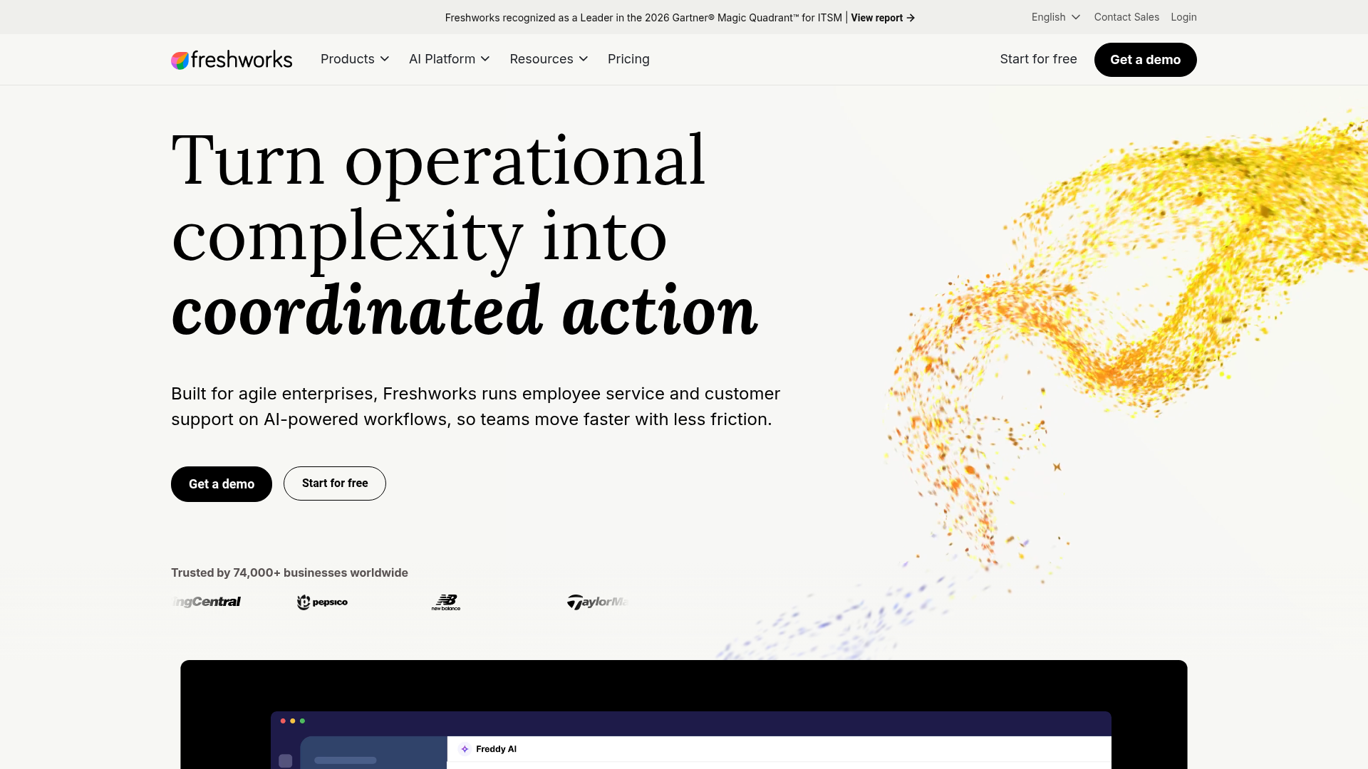
Freshworks lands a 78/100 overall score—a respectable position that masks a meaningful gap between how the page looks and how it guides visitors toward action. The aesthetic layer (81/100) outpaces both functional clarity (76/100) and practice consistency (78/100), suggesting the page is visually polished but strategically unclear. The customer logos and design execution are competent, yet the core job of the landing page—reducing friction and directing intent—shows strain. Two major functional issues dominate: the hero headline lacks specificity, and competing CTAs create decision paralysis rather than momentum.
Observed UX signals
- Majorfunctional
Clarity
Hero headline 'Turn operational complexity into coordinated action' is benefit-adjacent but abstract. The subheading clarifies the product (employee service and customer support on AI-powered workflows), but the primary headline does not immediately communicate what problem Freshworks solves or who it's for. A visitor must read the subheading to understand the core value.
- Majorfunctional
FocusHierarchy
Multiple competing CTAs above the fold ('Get a demo' and 'Start for free') create choice paralysis. Both are equally prominent and use similar visual weight, forcing visitors to decide between two paths without clear guidance on which is the primary conversion goal.
- Majorfunctional
ConversionOptimization
CTA copy is generic and does not articulate the immediate benefit or risk reversal. 'Get a demo' and 'Start for free' are standard but do not answer 'What happens next?' or 'Why should I act now?' No visible urgency, guarantee, or friction-reduction language (e.g., 'no credit card required', 'see results in 10 minutes', 'cancel anytime').
More UX reviews
Browse all →How does your site score?
Get the same layer-by-layer UX review for your homepage, pricing page, or product page.