Fly website UX review
A scan-backed analysis of how Fly performs across usability, visual clarity, and UX best practices. Use it as a reference for what to borrow, what to question, and what to test on your own site.
Sensei score: 76 out of 100
Aesthetic
79Practices
75How Fly looks
The verdict
A strong aesthetic foundation obscures functional friction
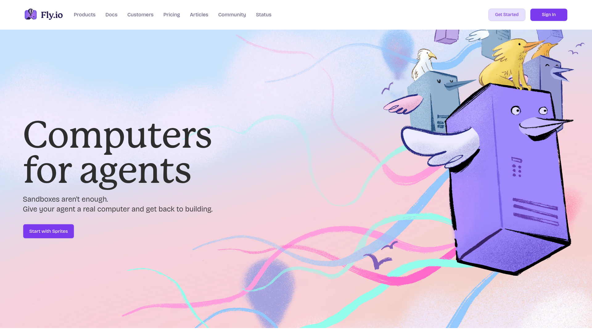
Fly.io's landing page scores 76/100 overall, with aesthetic execution (79) outpacing functional clarity (75) and practice adherence (75). The visual design is confident—the page presents itself as polished and intentional. However, the scan reveals a critical misalignment: the page looks good enough to pass initial inspection, but its information architecture and conversion design create unnecessary cognitive load for visitors who aren't already familiar with agent infrastructure or Fly's specific positioning.
Observed UX signals
- Majorfunctional
Clarity
Hero headline 'Computers for agents' is feature-focused and abstract. The subheading 'Sandboxes aren't enough. Give your agent a real computer and get back to building.' is benefit-oriented but requires inference that this is a hosting/infrastructure product. A visitor unfamiliar with agent development may not immediately understand what problem this solves or who it's for.
- Majorfunctional
Trust & Credibility
Social proof is present but weak. The 'Teams building on Fly.io' section lists 12 company logos (Kilocode, Builder.io, Hatchet, etc.) without context—no user counts, growth metrics, or specific outcomes. Testimonials at the bottom are attributed only by role and company type ('Platform Engineer Series B startup', 'Staff Engineer Fintech', 'Founder AI-first product'), not by name or recognizable company, reducing credibility.
- Majorfunctional
Conversion Optimization
Primary CTA 'Start with Sprites' appears multiple times but lacks benefit-oriented copy. The CTA does not answer 'what happens next?' or reduce friction (no mention of free trial, no credit card required, or time commitment). Secondary CTAs ('Explore Sprites', 'Explore Machines', 'Get support') are numerous and create choice paralysis without clear hierarchy.
More UX reviews
Browse all →How does your site score?
Get the same layer-by-layer UX review for your homepage, pricing page, or product page.