Fahertybrand website UX review
A scan-backed analysis of how Fahertybrand performs across usability, visual clarity, and UX best practices. Use it as a reference for what to borrow, what to question, and what to test on your own site.
Sensei score: 73 out of 100
Aesthetic
79Practices
69How Fahertybrand looks
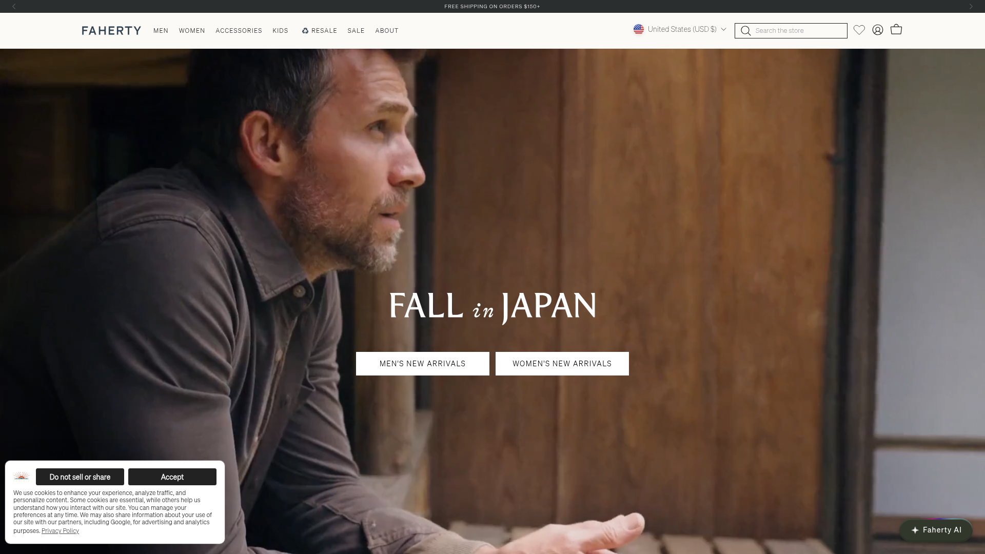
The verdict
A 73-point landing page with aesthetic polish masking functional gaps
Fahertybrand's landing page scores 73/100 overall—a solid result that reflects genuine strengths in visual design (79/100) alongside meaningful weaknesses in functional clarity and accessibility (71/100 and 69/100 respectively). The page demonstrates competent visual execution and brand presentation, but the gap between aesthetic confidence and functional rigor reveals a common pattern: a site that looks finished but lacks the structural clarity and inclusive design practices needed to reliably guide visitors or meet accessibility standards. The 'FALL in JAPAN' campaign hero dominates the fold with polished imagery, but this visual investment has not been matched by equivalent attention to information hierarchy, user guidance, or compliance.
Observed UX signals
- Majorfunctional
Clarity
Hero section lacks a clear value proposition or campaign headline. The page shows 'FALL in JAPAN' campaign with two CTAs ('MEN'S NEW ARRIVALS' and 'WOMEN'S NEW ARRIVALS'), but the primary job—what Faherty is and why a visitor should care—is not immediately evident from the hero alone. The brand name 'Faherty Brand' appears as the only H1, which is insufficient for a landing page.
- Majorfunctional
Accessibility
Eight images lack alt text (marked as 'null'), including key product category images: 'M_New_Arrivals', 'M_Stretch_Terry', 'W_New_Arrivals', 'W_Dresses', and 'Mega_Menu_Navigation'. This creates barriers for screen reader users and fails WCAG 2.1 Level A compliance. Two form inputs also lack associated labels.
- Majorfunctional
TrustCredibility
No visible social proof, testimonials, or credibility signals above the fold. The meta description mentions 'family owned' and 'sustainably-sourced,' but these trust anchors are not reinforced in the hero or immediately visible content. No user counts, ratings, press mentions, or certifications are evident in the page data.
More UX reviews
Browse all →How does your site score?
Get the same layer-by-layer UX review for your homepage, pricing page, or product page.