Eightsleep website UX review
A scan-backed analysis of how Eightsleep performs across usability, visual clarity, and UX best practices. Use it as a reference for what to borrow, what to question, and what to test on your own site.
Sensei score: 78 out of 100
Aesthetic
80Practices
78How Eightsleep looks
The verdict
A visually confident page held back by unclear positioning
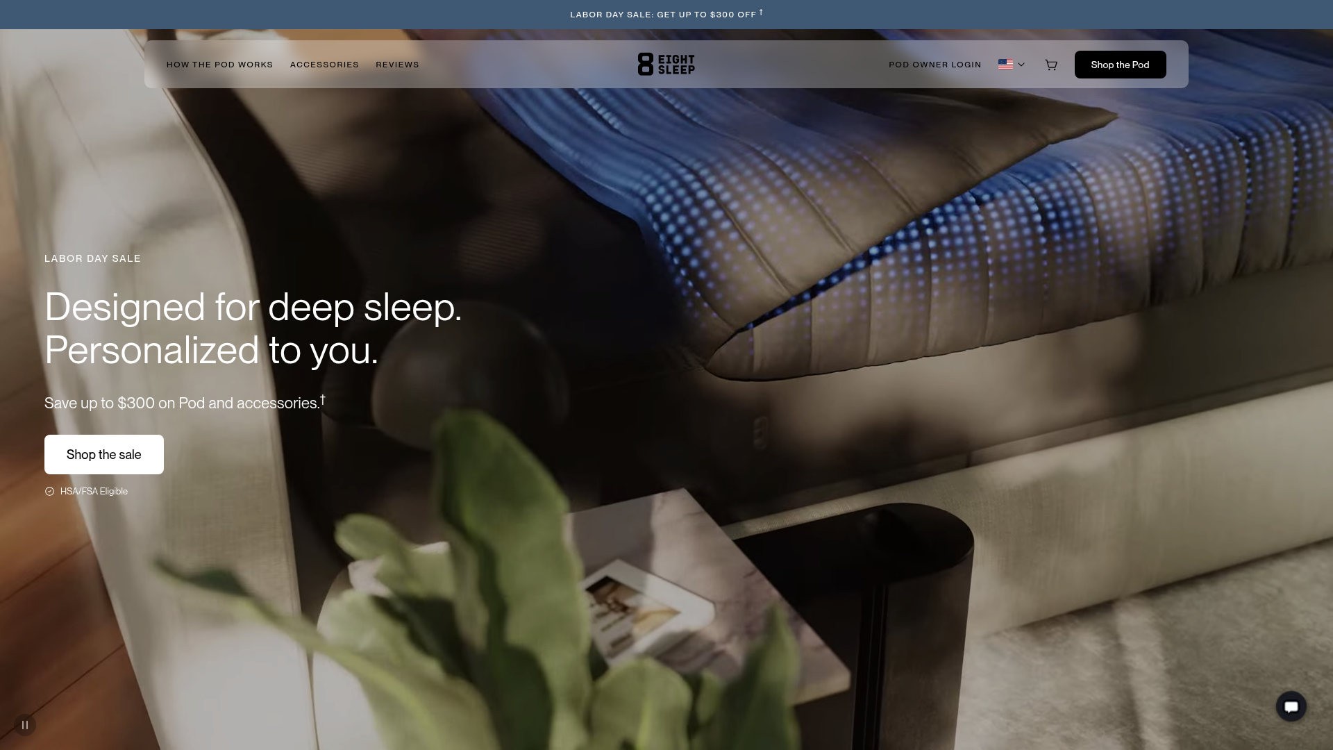
Eightsleep's landing page scores 78/100 overall—a strong result that masks a structural tension between what the page shows and what it says. The aesthetic layer (80/100) performs best, suggesting the visual design, photography, and layout craft are solid. The functional layer (77/100) and practices layer (78/100) lag slightly, revealing friction in how the page communicates product identity and guides visitors toward conversion. This gap is diagnostic: the page looks polished but doesn't leverage that polish to clarify what Eightsleep actually sells or why a visitor should act now rather than later.
Observed UX signals
- Majorfunctional
Clarity
Primary value proposition relies on visual context (hero image of bed) rather than explicit product identity. The headline 'Designed for deep sleep. Personalized to you.' does not immediately communicate that this is a bed cooling/heating system or what makes it unique.
- Majorfunctional
Conversion Optimization
Multiple competing CTAs above the fold ('Shop the sale', 'Shop the Pod' appears twice, 'Learn More') create choice paralysis. The primary conversion action is not visually or textually differentiated from secondary actions.
- Majorfunctional
Trust & Credibility
Celebrity/influencer endorsements (Elon Musk, Joe Rogan, Mark Zuckerberg) are presented as social proof, but lack context about their relationship to the product or verification. Twitter quotes are included but lack timestamps or direct attribution clarity in some cases.
More UX reviews
Browse all →How does your site score?
Get the same layer-by-layer UX review for your homepage, pricing page, or product page.