Distributional website UX review
A scan-backed analysis of how Distributional performs across usability, visual clarity, and UX best practices. Use it as a reference for what to borrow, what to question, and what to test on your own site.
Sensei score: 70 out of 100
Aesthetic
81Practices
67How Distributional looks
The verdict
A rebrand announcement caught between two purposes
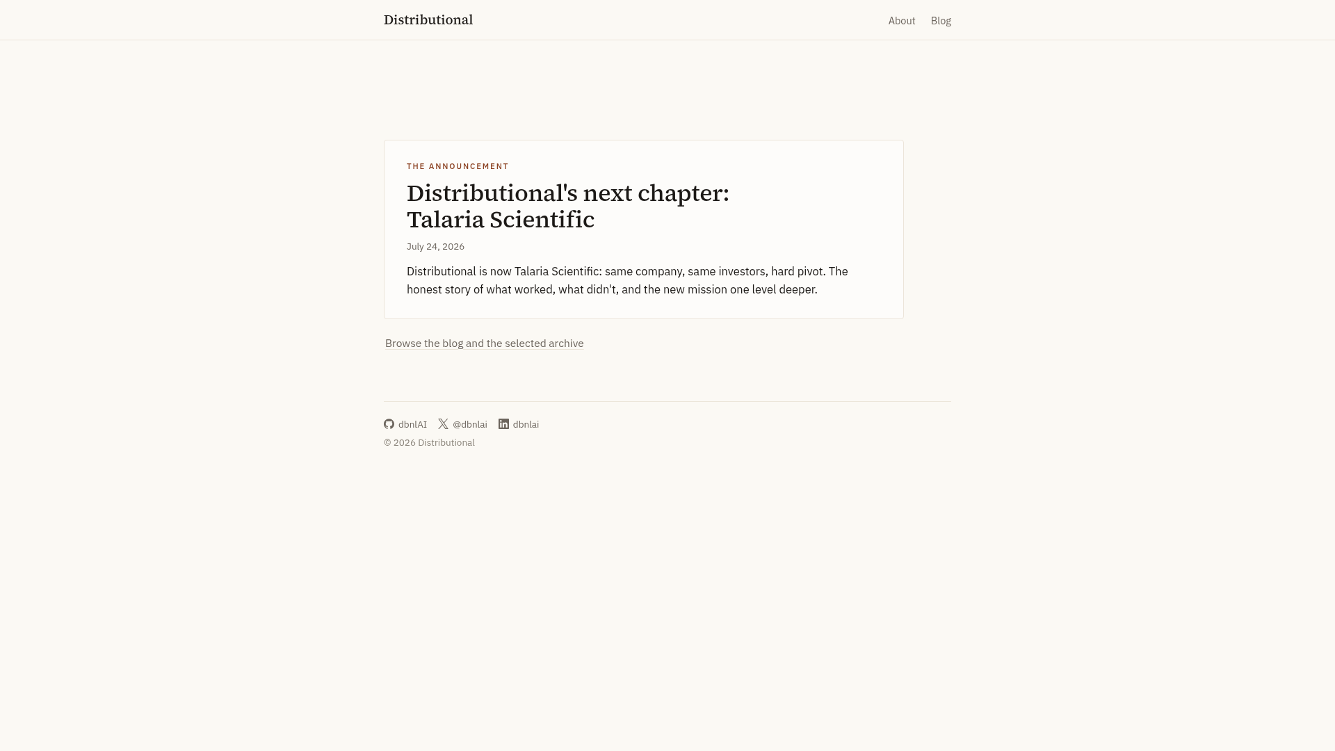
Distributional's landing page scores 70/100 overall—a respectable result that masks a fundamental tension in its design. The aesthetic layer (81/100) is clearly the page's strength: visual presentation and design craft are confident and well-executed. But that polish sits atop functional and practice layers that both score in the mid-60s, suggesting the page knows how to look good without knowing quite what it wants visitors to do. The page presents itself as an announcement of a rebrand from Talaria Scientific to Distributional, paired with an invitation to explore archived blog content. Neither purpose is served well by the current structure, and the gap between how the page looks and what it actually accomplishes is the core diagnostic here.
Observed UX signals
- Criticalfunctional
Conversion Optimization
No primary CTA above the fold. The page contains only navigation links and a blog post link buried in body text ('Browse the blog and the selected archive'). There is no clear call-to-action that guides visitors toward the next step after reading the announcement.
- Majorfunctional
Trust & Credibility
No social proof, credentials, or trust signals visible. The announcement mentions 'same company, same investors, hard pivot' but provides no verifiable evidence, logos, press mentions, or links to validate these claims. Visitors cannot assess the legitimacy of the rebrand without additional context.
- Majorfunctional
Conversion Optimization
The announcement copy ('same company, same investors, hard pivot. The honest story of what worked, what didn't, and the new mission one level deeper') creates curiosity but does not explain what Talaria Scientific does or why a visitor should care. The value proposition is missing.
More UX reviews
Browse all →How does your site score?
Get the same layer-by-layer UX review for your homepage, pricing page, or product page.