Dashsocial website UX review
A scan-backed analysis of how Dashsocial performs across usability, visual clarity, and UX best practices. Use it as a reference for what to borrow, what to question, and what to test on your own site.
Sensei score: 75 out of 100
Aesthetic
78Practices
74How Dashsocial looks
The verdict
A solid landing page held back by conversion friction
Dashsocial's landing page scores 75/100 overall—a respectable result that masks a specific tension between aesthetic confidence and functional clarity. The aesthetic layer (78) outperforms functional performance (72), suggesting the page looks polished but doesn't guide visitors efficiently toward conversion. This gap is diagnostic: when a landing page is visually competent but functionally muddled, the problem is rarely design craft. It's usually about clarity of purpose and the removal of decision friction.
Observed UX signals
- Majorfunctional
Clarity
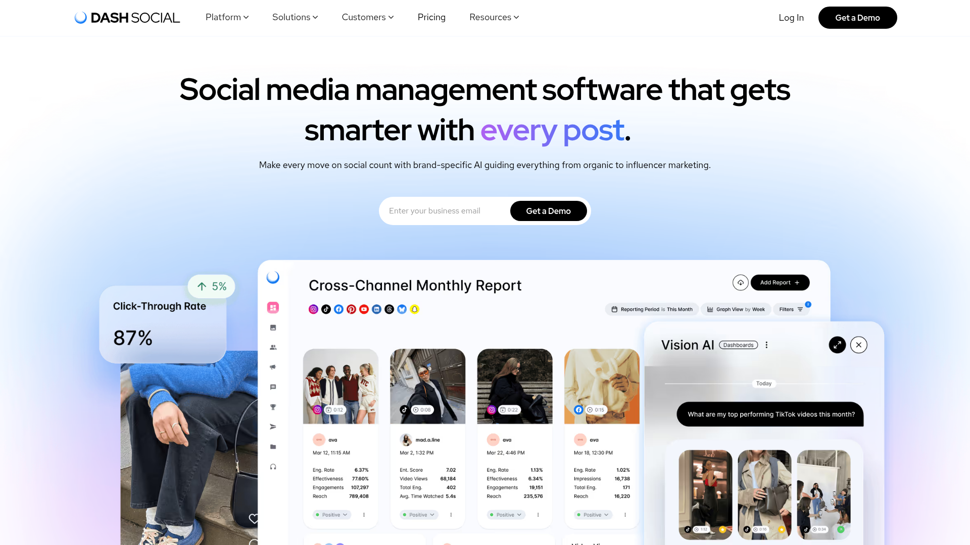
Hero headline uses feature-stacking ('gets smarter with every post. every creator. every ad.') rather than a single, benefit-focused value proposition. The multi-line format creates ambiguity about the core job—users must infer that this is about social media management software.
- Majorfunctional
Conversion Optimization
Primary CTA in the hero ('Get a Demo') lacks benefit-oriented copy and risk reversal. No inline messaging addresses common objections (e.g., 'Free demo—no credit card required' or 'See results in 15 minutes'). The form field placeholder 'Enter your business email' is generic and does not reduce friction.
- Majorfunctional
Focus & Hierarchy
Navigation menu contains 5 top-level items (Platform, Solutions, Customers, Pricing, Resources) plus secondary CTAs (Log In, Get a Demo) in the header. This creates competing visual weight and cognitive load above the fold, diluting focus from the primary conversion goal.
More UX reviews
Browse all →How does your site score?
Get the same layer-by-layer UX review for your homepage, pricing page, or product page.