Cultureamp website UX review
A scan-backed analysis of how Cultureamp performs across usability, visual clarity, and UX best practices. Use it as a reference for what to borrow, what to question, and what to test on your own site.
Sensei score: 76 out of 100
Aesthetic
80Practices
73How Cultureamp looks
The verdict
A 76-point landing with aesthetic polish masking functional friction
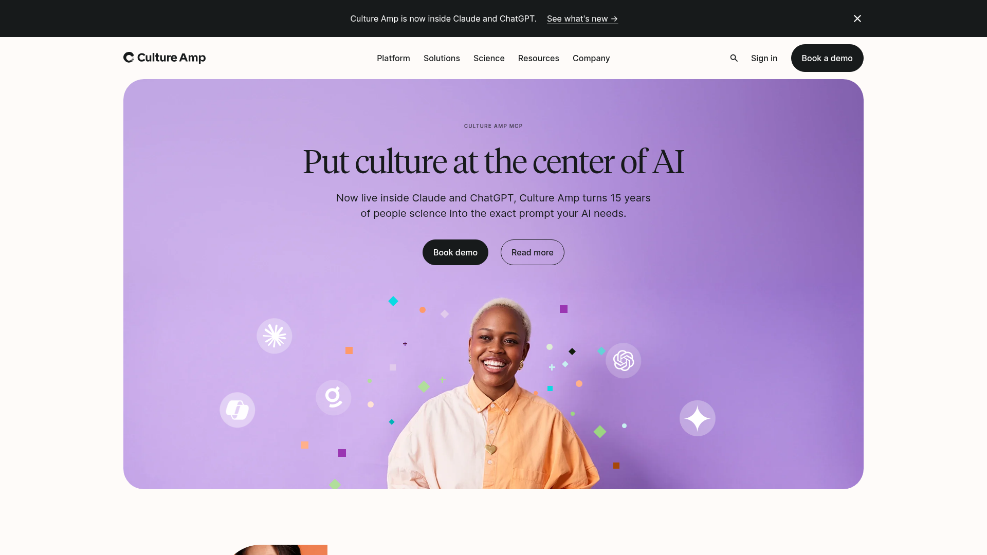
Cultureamp's homepage scores 76/100 overall—a solid result that reflects genuine design competence in visual presentation (80/100 aesthetic layer) but reveals meaningful gaps in functional clarity and conversion strategy (75/100 functional, 73/100 practices). The page demonstrates the common pattern of a well-designed surface that doesn't yet guide visitors efficiently toward action. The aesthetic layer's strength suggests the team has invested in visual hierarchy, spacing, and brand consistency. However, that investment hasn't translated into equally strong functional performance, where messaging clarity and conversion friction remain the primary limiting factors.
Observed UX signals
- Majorfunctional
Clarity
Hero headline 'Put culture at the center of AI' is abstract and benefit-unclear. The subheading mentions 'Culture Amp turns 15 years of people science into the exact prompt your AI needs,' which is jargon-heavy and doesn't immediately explain what the product does or why a visitor should care.
- Majorfunctional
Trust & Credibility
No visible social proof (customer logos, user counts, ratings, or testimonials) above the fold. The page jumps directly to feature messaging without establishing credibility. Case studies are present lower on the page but lack attribution details (company names visible but no employee counts, results metrics, or quotes).
- Majorfunctional
Conversion Optimization
Primary CTA copy is generic ('Book a demo' / 'Book demo'). No risk reversal, urgency, or benefit-oriented language. The form asks for 8+ fields (First Name, Last Name, Phone, Country, Company, Job Title, Employees, How can we help?) before submission, creating friction. No inline copy addressing common objections (e.g., 'No credit card required', 'Takes 15 minutes').
More UX reviews
Browse all →How does your site score?
Get the same layer-by-layer UX review for your homepage, pricing page, or product page.