Craft Do website UX review
A scan-backed analysis of how Craft Do performs across usability, visual clarity, and UX best practices. Use it as a reference for what to borrow, what to question, and what to test on your own site.
Sensei score: 76 out of 100
Aesthetic
78Practices
74How Craft Do looks
The verdict
A capable landing page held back by conversion clarity
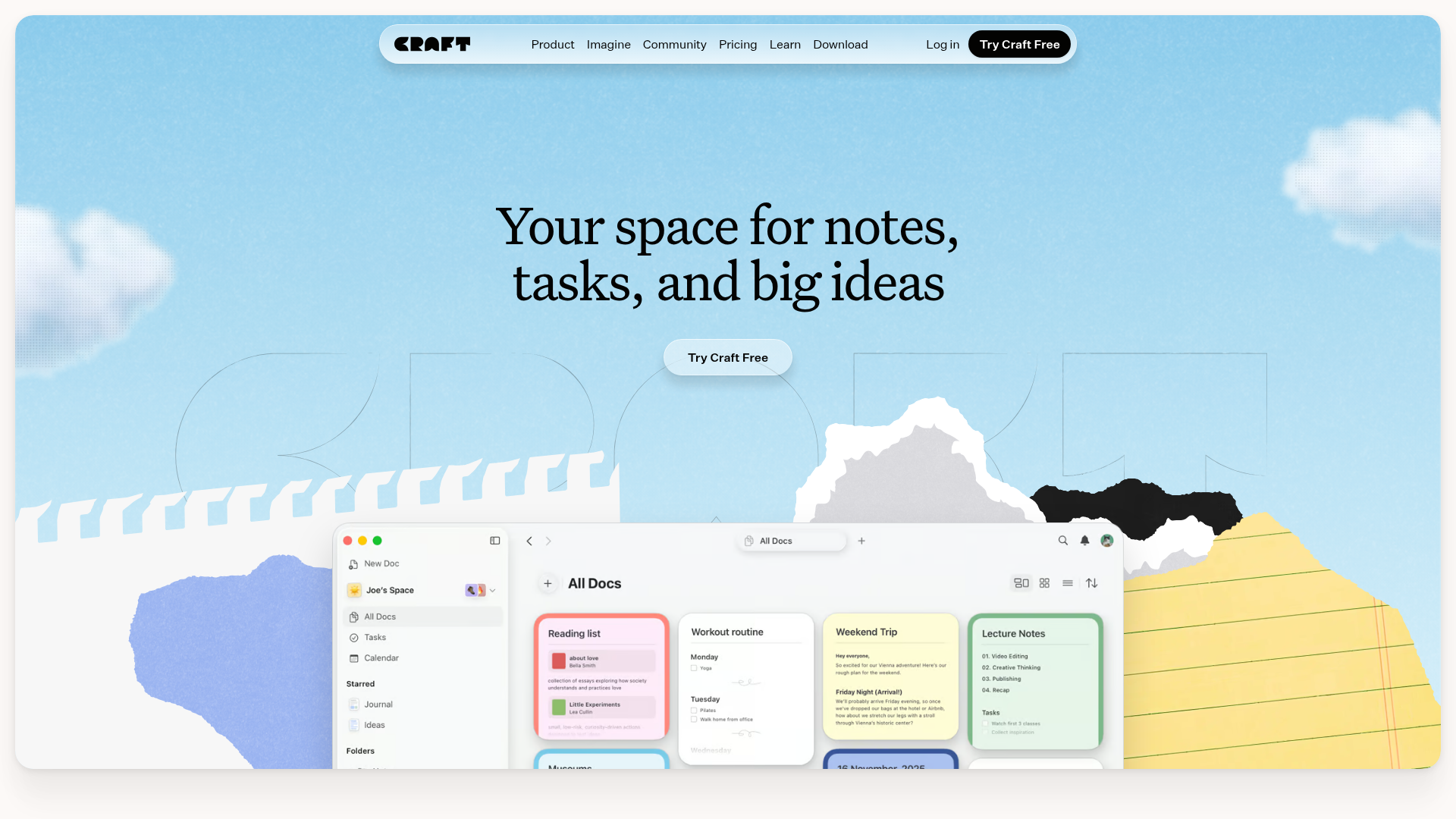
Craft Do's landing page scores 76/100 overall, with aesthetic execution (78) outpacing functional design (75) and practice adherence (74). The gap between layers is narrow but diagnostic: the page looks and feels polished, but its information architecture and conversion mechanics create friction that a visitor might not consciously feel but will experience as hesitation. The site has the visual confidence of a mature product, yet the messaging and navigation suggest the team hasn't fully committed to a single user journey or primary action.
Observed UX signals
- Majorfunctional
Trust & Credibility
Social proof is present but lacks specificity and quantification. User testimonials show names, roles, and use cases (e.g., 'Tom, Podcaster and newsletter writer'), but no metrics, user counts, ratings, or press mentions are visible above the fold to establish scale or authority.
- Majorfunctional
Conversion Optimization
Primary CTA copy is generic and benefit-agnostic. 'Try Craft Free' appears three times above the fold but does not communicate the outcome or risk reversal. No mention of 'no credit card required', 'cancel anytime', or time-limited access.
- Majorfunctional
Focus & Hierarchy
Navigation menu includes six primary links (Product, Imagine, Community, Pricing, Learn, Download) plus Log In and Try Craft Free. This creates competing focal points and violates Hick's Law (3-choice maximum at decision point). Visitors must choose between exploring features, pricing, learning, or signing up.
More UX reviews
Browse all →How does your site score?
Get the same layer-by-layer UX review for your homepage, pricing page, or product page.