Convex website UX review
A scan-backed analysis of how Convex performs across usability, visual clarity, and UX best practices. Use it as a reference for what to borrow, what to question, and what to test on your own site.
Sensei score: 77 out of 100
Aesthetic
78Practices
77How Convex looks
The verdict
A solid landing with misaligned messaging at the critical moment
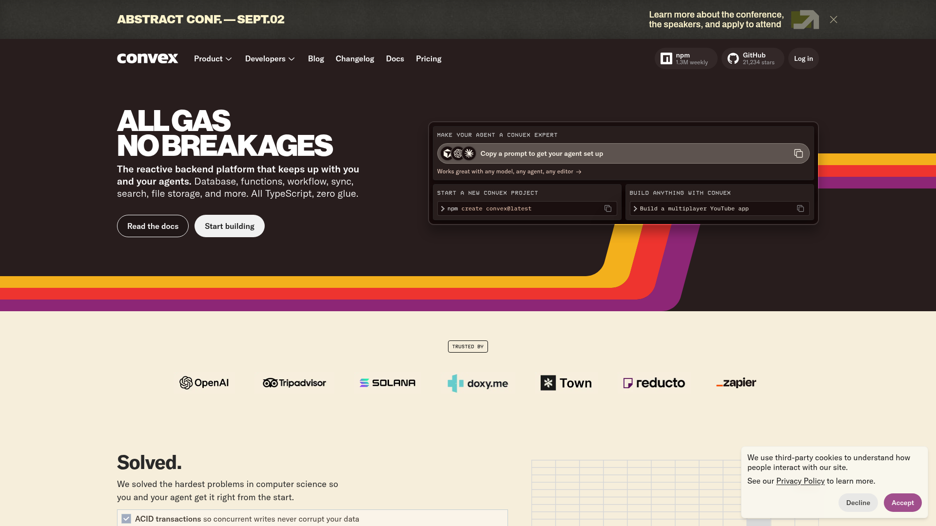
Convex's landing page scores 77/100 overall—a strong result that reflects competent execution across functional, aesthetic, and practice layers. The aesthetic layer (78) and practices layer (77) both perform reliably, suggesting the design system, visual hierarchy, and technical implementation are sound. But the functional layer (75) reveals a more consequential problem: the page asks visitors to do too many things at once, and the headline doesn't tell them what Convex actually does. For a developer-facing SaaS product, clarity at first glance is not optional. The gap between aesthetic polish and functional clarity suggests the page looks confident but doesn't communicate confidently.
Observed UX signals
- Majorfunctional
Clarity
Headline 'All gas no breakages' is colloquial and does not immediately communicate the core value proposition. While memorable, it requires the subheading to clarify that this is a 'reactive backend platform.' A visitor unfamiliar with Convex may not grasp the product category within 5 seconds.
- Majorfunctional
Conversion Optimization
Primary CTAs ('Read the docs' and 'Start building') appear twice on the page with identical text and destinations, creating redundancy. The hero section offers two CTAs with no clear hierarchy or differentiation in copy—both are equally generic and do not use benefit-oriented language.
- Majorfunctional
Focus & Hierarchy
The page presents multiple competing entry points: 'Make your agent a Convex expert' (AI-focused), 'Start a new Convex project' (general developer), and 'Build anything with Convex' (product showcase). These are repeated and create ambiguity about the primary audience and next step. The hero does not establish a single, clear conversion goal.
More UX reviews
Browse all →How does your site score?
Get the same layer-by-layer UX review for your homepage, pricing page, or product page.