Column website UX review
A scan-backed analysis of how Column performs across usability, visual clarity, and UX best practices. Use it as a reference for what to borrow, what to question, and what to test on your own site.
Sensei score: 76 out of 100
Aesthetic
80Practices
74How Column looks
The verdict
A strong aesthetic foundation with functional clarity gaps
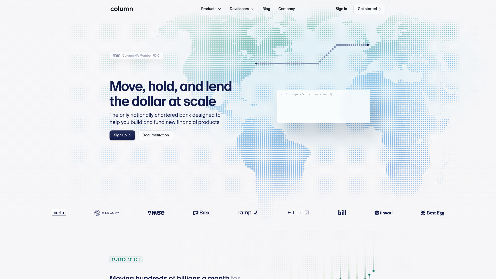
Column's landing page scores 76/100 overall, with aesthetic execution (80) outpacing functional design (74) and practice consistency (74). The page demonstrates confident visual design and a clear benefit-oriented hero headline—'Move, hold, and lend the dollar at scale'—that immediately signals what the product does. However, this functional strength is undermined by competing conversion paths, unclear audience targeting, and trust signals that lack the visual reinforcement needed to feel credible. The gap between aesthetic and functional scores suggests a design that looks polished but doesn't yet guide visitors efficiently toward their next action.
Observed UX signals
- Majorfunctional
Clarity
Hero headline 'Move, hold, and lend the dollar at scale' is benefit-oriented and clear, but the subheading 'The only nationally chartered bank designed to help you build and fund new financial products' uses industry jargon ('nationally chartered bank') that may not resonate with all visitor segments. The page targets both developers and financial institutions, creating potential confusion about primary audience.
- Majorfunctional
Trust & Credibility
Social proof is present (Brex testimonial, transaction volume metrics: '$4.5T+ Annual transaction volume', '99.999% Uptime'), but the testimonial lacks visual attribution—no photo, title, or company logo visible for Pedro Franceschi. The quote 'No one comes close to Column's level of technical infrastructure' is strong, but without face/company visual, it feels less credible than it could.
- Majorfunctional
Focus & Hierarchy
The page presents three distinct product categories (Infrastructure, Lending, Financial Institutions) with multiple sub-products under each. Above the fold, the primary CTA is 'Sign up', but the page also offers 'Documentation' as an equal-weight alternative. Below the fold, 'Learn about our bank' and 'Contact sales' appear, creating multiple competing conversion paths without clear hierarchy or audience segmentation.
More UX reviews
Browse all →How does your site score?
Get the same layer-by-layer UX review for your homepage, pricing page, or product page.
Scan your websiteSign in to run a fresh private scan