Coda website UX review
A scan-backed analysis of how Coda performs across usability, visual clarity, and UX best practices. Use it as a reference for what to borrow, what to question, and what to test on your own site.
Sensei score: 72 out of 100
Aesthetic
77Practices
70How Coda looks
The verdict
A 72-point landing page held back by messaging conflict
Coda's landing page scores solidly across functional, aesthetic, and practice layers—70, 77, and 70 respectively—but the overall 72 masks a structural problem that undermines conversion potential. The aesthetic layer's strength (77) reflects confident visual design and layout discipline, yet that polish cannot overcome functional friction that forces visitors to make unnecessary decisions before they understand what they're being asked to do. The page performs best where it controls complexity; it falters where it multiplies choice.
Observed UX signals
- Majorfunctional
Clarity
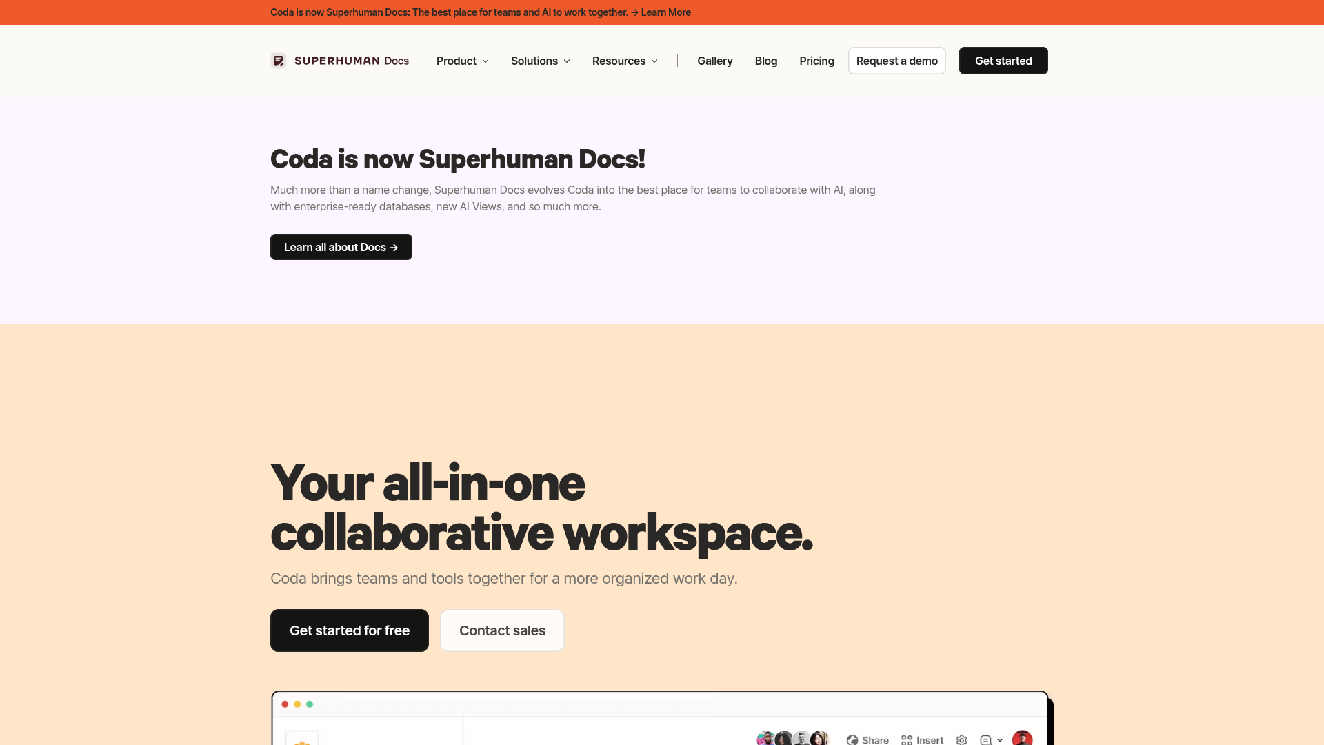
Dual competing headlines create confusion about the page's primary message. The hero announces 'Coda is now Superhuman Docs!' while the main value proposition is 'Your all-in-one collaborative workspace.' Users must infer whether this is a rebrand announcement or a product landing page.
- Majorfunctional
Focus & Hierarchy
Multiple competing CTAs above the fold ('Get started for free', 'Contact sales', 'Learn all about Docs →') create choice paralysis. No clear visual or positional hierarchy distinguishes the primary conversion action from secondary paths.
- Majorfunctional
Trust & Credibility
Social proof is present ('50,000+ teams', Fast Company quote) but lacks specificity and context. The quote attribution is minimal ('Fast Company') without date, publication link, or full context. No visible customer logos, ratings, or detailed testimonials with names/titles/companies above the fold.
More UX reviews
Browse all →How does your site score?
Get the same layer-by-layer UX review for your homepage, pricing page, or product page.