Cloudflare website UX review
A scan-backed analysis of how Cloudflare performs across usability, visual clarity, and UX best practices. Use it as a reference for what to borrow, what to question, and what to test on your own site.
Sensei score: 78 out of 100
Aesthetic
80Practices
79How Cloudflare looks
The verdict
A strong visual identity masking functional friction
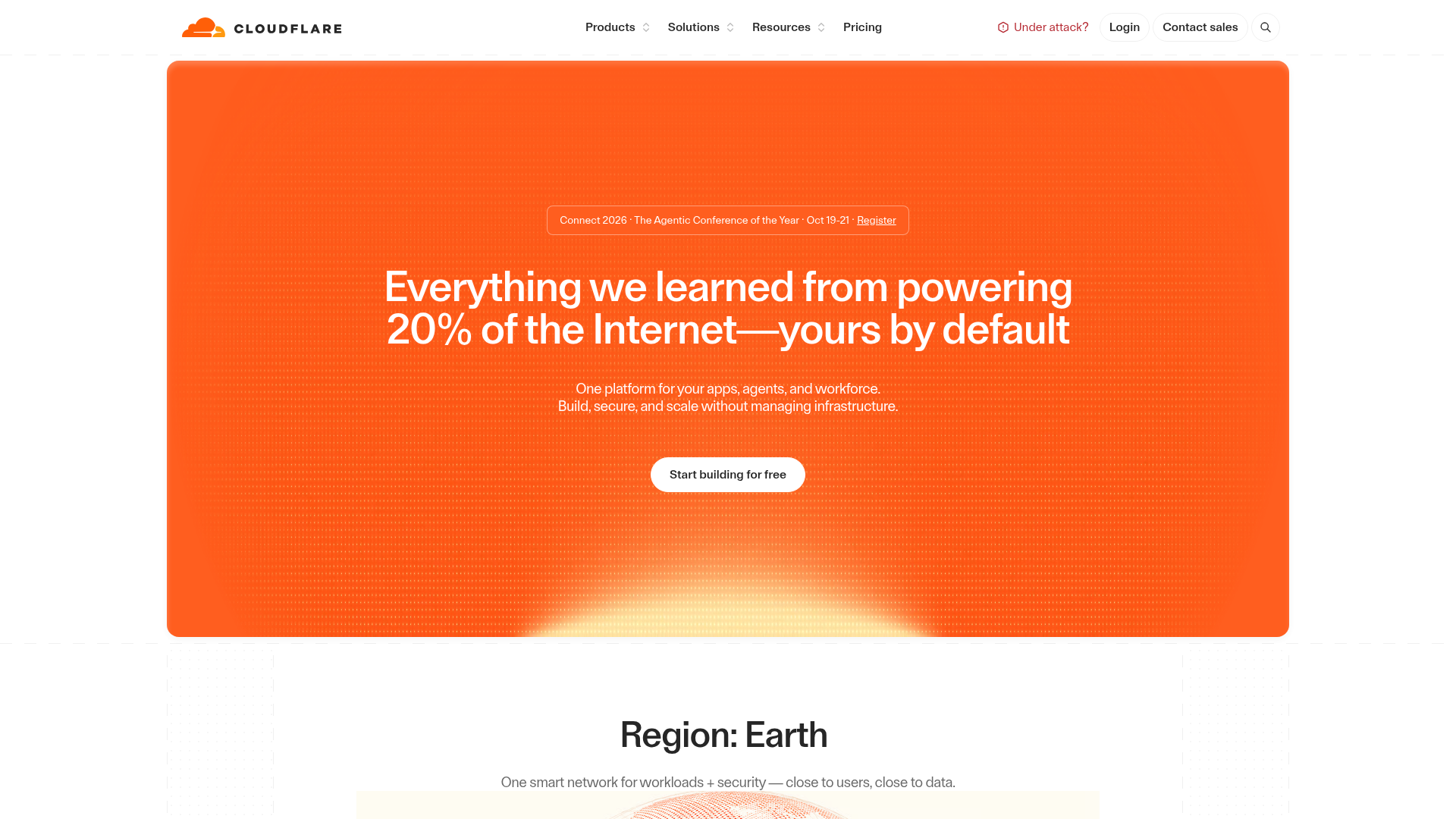
Cloudflare's landing page scores 78/100 overall, with aesthetic confidence (80) outpacing functional clarity (75). The gap is telling: the page looks polished and on-brand, but visitors encounter decision friction before they understand what they're deciding between. The vibrant orange hero with gradient fade creates immediate visual impact—appropriate for a platform claiming to power 20% of the Internet—yet that same visual intensity works against the stated goal of positioning Cloudflare as a trustworthy, calm enterprise solution. For a B2B infrastructure company, this tension between striking design and reassuring function matters. Visitors arrive seeking reliability and clarity; they're met first with saturation and ambiguity.
Observed UX signals
- Majorfunctional
Clarity
Hero headline 'Everything we learned from powering 20% of the Internet—yours by default' leads with a feature (market share) rather than a clear benefit or transformation. A visitor unfamiliar with Cloudflare must infer what 'yours by default' means and why 20% matters to them.
- Majorfunctional
Conversion Optimization
Primary CTA 'Start building for free' is present but the page offers multiple competing CTAs in the navigation (Login, Dashboard, Contact sales, Start building) without clear visual or functional hierarchy. On a homepage, this creates decision paralysis and dilutes conversion focus.
- Minorfunctional
Trust & Credibility
Testimonial from Shopify includes a quote and attribution ('Duncan Davidson') with company logo, which is strong. However, the page data shows only one visible testimonial above the fold. For a B2B infrastructure platform, additional social proof (customer count, press mentions, certifications) would reinforce credibility earlier.
More UX reviews
Browse all →How does your site score?
Get the same layer-by-layer UX review for your homepage, pricing page, or product page.