Chime website UX review
A scan-backed analysis of how Chime performs across usability, visual clarity, and UX best practices. Use it as a reference for what to borrow, what to question, and what to test on your own site.
Sensei score: 79 out of 100
Aesthetic
80Practices
79How Chime looks
The verdict
A solid landing with conversion friction at the moment of action
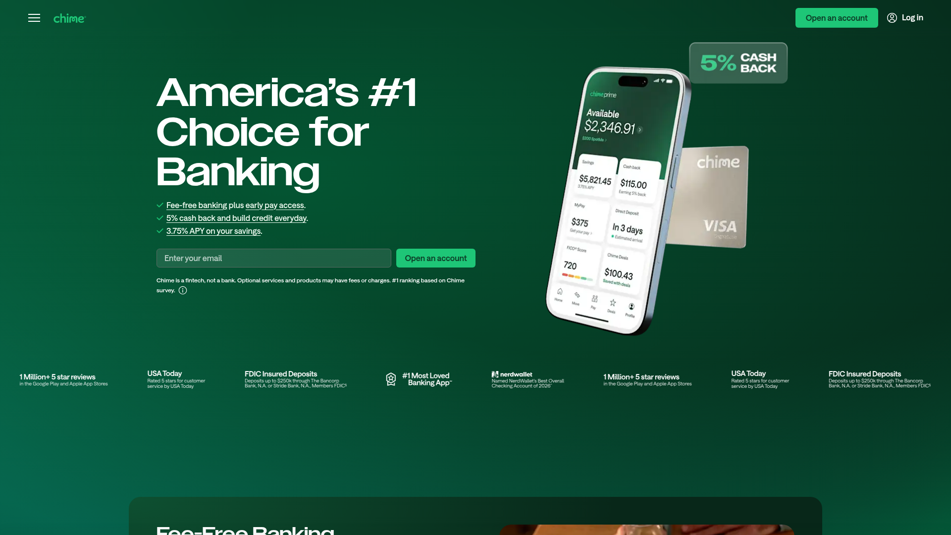
Chime's landing page scores 79/100 overall—a strong result that reflects competent execution across functional, aesthetic, and practice layers. The aesthetic layer leads at 80, suggesting the visual design and layout choices are well-calibrated. Functional (77) and Practices (79) lag slightly, but the gap is narrow enough to indicate no systemic design failure. The real diagnostic emerges when examining where the score breaks: the page performs well at *introducing* value but struggles at *channeling* users toward signup. Three high-value benefits (fee-free banking, 5% cash back, 3.75% APY) are clearly stated in the hero, yet the conversion mechanism—the primary CTA—does not reinforce which benefit the user will experience first or why signup is frictionless. This mismatch between promise and action is the page's primary weakness.
Observed UX signals
- Majorfunctional
Conversion Optimization
Primary CTA copy is generic ('Open an account') and lacks benefit-oriented language. The hero section lists three key benefits (fee-free banking, 5% cash back, 3.75% APY) but the CTA does not reinforce which benefit the user will unlock first or emphasize the speed/ease of signup.
- Majorfunctional
Focus & Hierarchy
Multiple competing CTAs and feature modules below the hero (Fee-Free Banking, 5% Cash Back, Grow Credit, Easy Savings, Early Payday, 24/7 Support) create cognitive load. While each has a 'Learn More' link, the page does not establish a clear primary conversion path or indicate which feature is most important to the user journey.
- Majorfunctional
Conversion Optimization
No visible risk reversal or urgency signal in the hero or near the primary CTA. The page does not communicate 'no credit check required,' 'instant approval,' 'cancel anytime,' or any other friction-reducing guarantee that would lower signup hesitation.
More UX reviews
Browse all →How does your site score?
Get the same layer-by-layer UX review for your homepage, pricing page, or product page.
Scan your websiteSign in to run a fresh private scan