Casper website UX review
A scan-backed analysis of how Casper performs across usability, visual clarity, and UX best practices. Use it as a reference for what to borrow, what to question, and what to test on your own site.
Sensei score: 72 out of 100
Aesthetic
72Practices
72How Casper looks
The verdict
A solid performer held back by conversion clarity
Casper's landing page scores 72/100 overall, with balanced performance across functional (71), aesthetic (72), and practices (72) layers. The page demonstrates competent design execution and visual polish, but stumbles on a fundamental conversion problem: it asks visitors to choose between competing priorities before establishing why they should care. The scan reveals a page that knows how to present itself but hasn't yet decided what it's selling—a distinction that matters enormously for e-commerce landing pages where decision friction directly impacts conversion.
Observed UX signals
- Majorfunctional
Clarity
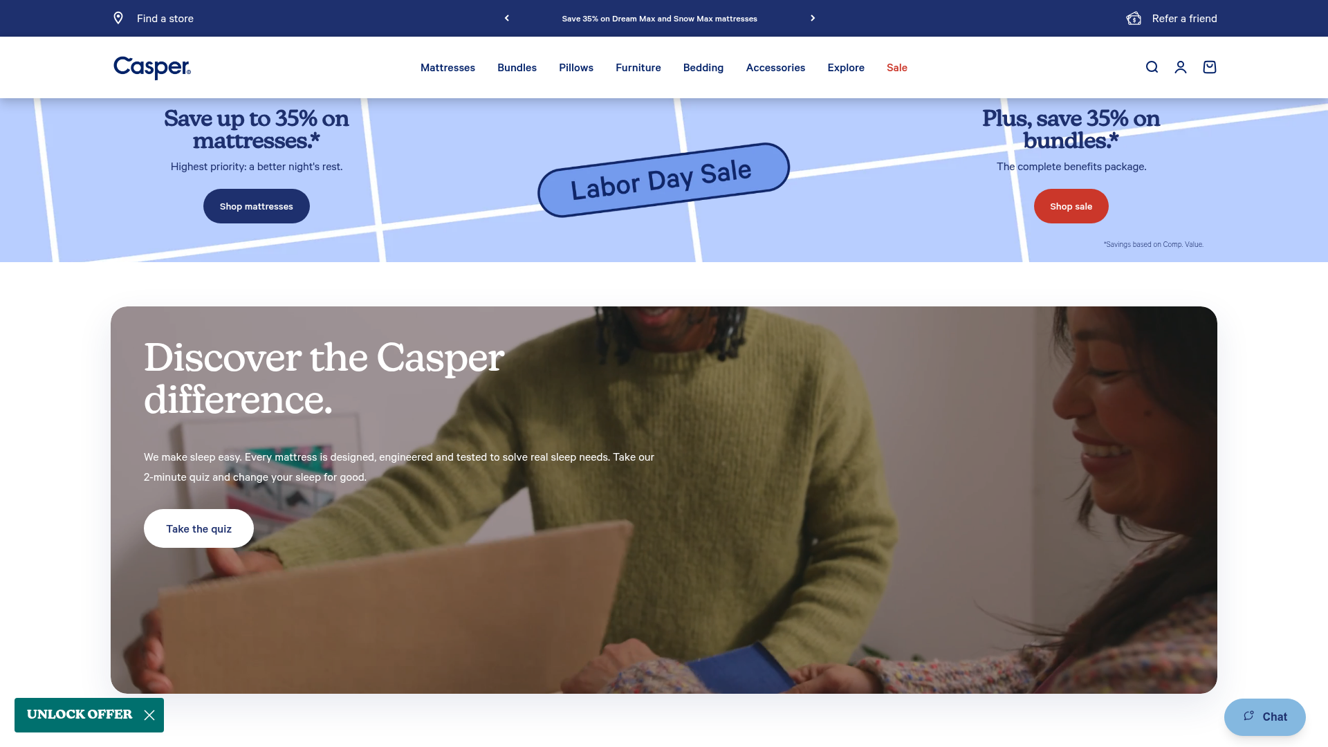
Primary value proposition is buried and feature-focused. The hero section leads with 'Save up to 35% on mattresses' and 'Plus, save 35% on bundles' rather than the core benefit. The actual benefit ('Highest priority: a better night's rest' and 'The complete benefits package') is secondary subheading text that doesn't immediately answer why someone should choose Casper.
- Majorfunctional
FocusHierarchy
Multiple competing primary CTAs above the fold create choice paralysis. The hero section presents 'Shop mattresses' and 'Shop sale' as equally prominent buttons, followed by a 'Take the quiz' CTA in the secondary section. Navigation menu also offers 'Mattresses', 'Bundles', 'Pillows', 'Furniture', 'Bedding', 'Accessories', and 'Explore' — all at the same visual weight.
- Majorfunctional
ConversionOptimization
CTA copy is generic and transactional rather than benefit-oriented. 'Shop mattresses', 'Shop sale', and 'Shop all bundles' focus on the action, not the outcome. The quiz CTA 'Take the quiz' is better but lacks context about what the user will gain.
More UX reviews
Browse all →How does your site score?
Get the same layer-by-layer UX review for your homepage, pricing page, or product page.