Cash website UX review
A scan-backed analysis of how Cash performs across usability, visual clarity, and UX best practices. Use it as a reference for what to borrow, what to question, and what to test on your own site.
Sensei score: 79 out of 100
Aesthetic
79Practices
85How Cash looks
The verdict
A strong visual and procedural foundation undermined by conflicting priorities
Cash App's landing page scores 79/100 overall, with particular strength in Practices (85) and Aesthetic design (79), but a notable gap in Functional clarity (74). The gap is diagnostic: the page looks polished and follows modern design conventions, but its information architecture forces visitors to resolve ambiguity about what the product actually does before they can commit to a next step. For a financial services product where trust and clarity are prerequisites to conversion, this functional weakness compounds across the entire funnel.
Observed UX signals
- Majorfunctional
Clarity
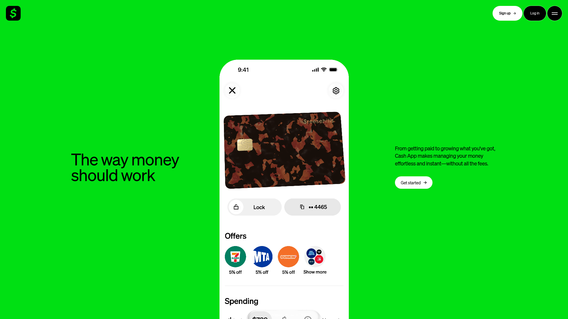
Hero section presents a benefit-focused headline ('The way money should work') but the subheading immediately pivots to feature enumeration ('From getting paid to growing what you've got, Cash App makes managing your money effortless and instant—without all the fees'). For a visitor unfamiliar with Cash App, the core job remains ambiguous: is this a payment app, a savings app, an investment app, or a banking alternative?
- Majorfunctional
Trust & Credibility
Social proof is present ('59 million+ active accounts') but appears only at the bottom of the page, far below the fold. The testimonial ('Cash App makes it so easy to manage everything—I use it for saving, splitting bills, and getting paid') lacks attribution: no name, photo, title, or company. This reduces credibility impact at the critical decision moment.
- Majorfunctional
Focus & Hierarchy
The page presents 8 major feature sections (Green, Card, Access Cash, Tags, Savings, Sending, Security, Reviews), each with its own heading and CTA. This creates competing focal points and violates Hick's Law. A visitor must choose between 'Learn about Green,' 'Learn more,' 'Explore tags,' 'Learn how to save,' 'Send money,' 'Learn about security,' and 'Read reviews'—all before a clear primary conversion path emerges.
More UX reviews
Browse all →How does your site score?
Get the same layer-by-layer UX review for your homepage, pricing page, or product page.
Scan your websiteSign in to run a fresh private scan