Carta website UX review
A scan-backed analysis of how Carta performs across usability, visual clarity, and UX best practices. Use it as a reference for what to borrow, what to question, and what to test on your own site.
Sensei score: 78 out of 100
Aesthetic
81Practices
75How Carta looks
The verdict
A solid landing page undermined by conversion friction
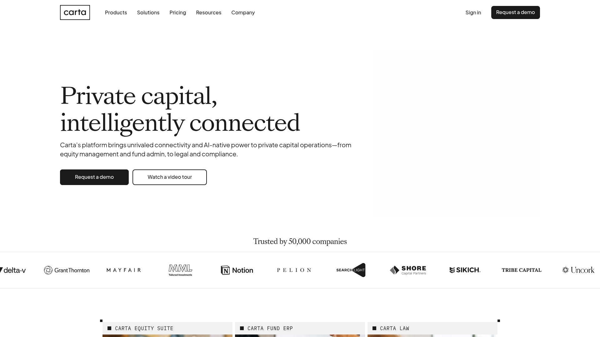
Carta's landing page scores 78/100 overall, with aesthetic execution (81) outpacing functional clarity (78) and best practices (75). The gap between these layers tells the story: the page looks confident and professional, but the underlying conversion logic is muddled. For a B2B SaaS platform serving private capital operations—a segment where trust and clarity are non-negotiable—this functional softness is a meaningful liability. The aesthetic strength masks rather than supports the primary conversion goal.
Observed UX signals
- Majorfunctional
Focus & Hierarchy
Multiple competing primary CTAs above the fold ('Request a demo' appears in nav, hero, and as duplicate in hero section) create choice paralysis. The hero section presents two equally weighted CTAs ('Request a demo' and 'Watch a video tour') without clear visual or copy hierarchy to guide the primary conversion path.
- Majorfunctional
Conversion Optimization
Primary CTA copy is generic and benefit-agnostic. 'Request a demo' does not communicate what value the visitor will gain or reduce perceived friction (e.g., no mention of time commitment, no risk reversal). Secondary CTA 'Watch a video tour' is equally prominent, splitting intent.
- Majorfunctional
Conversion Optimization
No visible risk reversal or friction-reduction signals near the primary CTA. For a B2B SaaS platform targeting private capital operations, visitors expect assurance about data security, implementation time, or trial availability. The page offers no inline reassurance.
More UX reviews
Browse all →How does your site score?
Get the same layer-by-layer UX review for your homepage, pricing page, or product page.
Scan your websiteSign in to run a fresh private scan