Canva website UX review
A scan-backed analysis of how Canva performs across usability, visual clarity, and UX best practices. Use it as a reference for what to borrow, what to question, and what to test on your own site.
Sensei score: 76 out of 100
Aesthetic
80Practices
70How Canva looks
The verdict
A strong visual foundation undermined by conversion friction
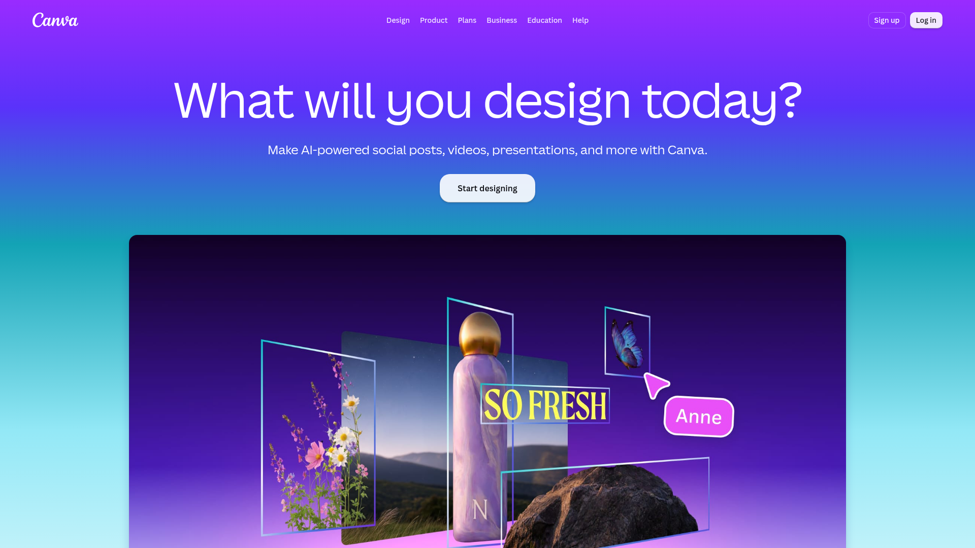
Canva's landing page scores 76/100 overall, with aesthetic execution (80) notably outpacing functional clarity (77) and practice adherence (70). The gap is diagnostic: the page looks polished and brand-coherent, but the underlying architecture—navigation, hierarchy, and messaging—creates unnecessary friction for first-time visitors deciding whether to convert. The vibrant purple-to-teal gradient and energetic visual treatment successfully communicate creative possibility, yet that same intensity compounds cognitive load when paired with structural choices that obscure rather than illuminate the core value proposition.
Observed UX signals
- Majorfunctional
Trust & Credibility
No social proof, user counts, testimonials, or trust signals visible above the fold. The page lacks credibility anchors (e.g., 'Trusted by X million users', customer logos, ratings) that would reduce friction for first-time visitors.
- Majorfunctional
Focus & Hierarchy
Page presents 50+ links and multiple competing CTAs ('Start designing', 'Try Presentations', 'Get started for free', 'Start designing for free') without clear visual or functional hierarchy. Navigation menu exposes 10+ product categories (Sheets, Docs, Whiteboards, Presentations, Social, etc.), creating cognitive overload and unclear primary conversion path.
- Minorfunctional
Clarity
Hero subheading 'Make AI-powered social posts, videos, presentations, and more with Canva' lists features rather than leading with a user outcome or transformation. Benefit is implied but not explicit.
More UX reviews
Browse all →How does your site score?
Get the same layer-by-layer UX review for your homepage, pricing page, or product page.