Calendly website UX review
A scan-backed analysis of how Calendly performs across usability, visual clarity, and UX best practices. Use it as a reference for what to borrow, what to question, and what to test on your own site.
Sensei score: 78 out of 100
Aesthetic
80Practices
78How Calendly looks
The verdict
A confident visual presentation masking conversion friction
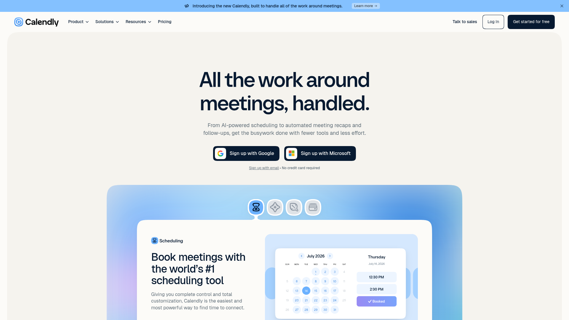
Calendly's landing page scores 78/100 overall, with aesthetic execution (80) outpacing functional clarity (75). The gap is instructive: the page looks polished and organized, but the underlying user journey is fragmented. Visitors encounter a well-designed interface that doesn't clearly guide them toward a single outcome. This is a common pattern in mature SaaS products—visual refinement can obscure structural problems in how value is communicated and how conversion paths are prioritized.
Observed UX signals
- Majorfunctional
Trust & Credibility
Social proof is minimal and lacks specificity. The page shows '$1,200 annual savings' and '100% attendance rate' as customer results, but provides no attribution (names, companies, titles, photos) or context for these claims. No customer logos, testimonial quotes, or third-party validation (press mentions, certifications, ratings) are visible above the fold.
- Majorfunctional
Conversion Optimization
Primary CTA copy is generic and benefit-light. 'Get started for free' appears multiple times but does not articulate the immediate value or address common objections. The subtext 'No credit card required' is present but buried in small text. Risk reversal is minimal—no mention of free trial duration, money-back guarantee, or cancellation terms.
- Majorfunctional
Focus & Hierarchy
Multiple competing CTAs and product modules create cognitive load. The page presents five major product features (Scheduling, Callie AI, Notetaker, Payments, Contacts) with separate 'Learn more' links, plus repeated 'Get started for free' and 'Talk to sales' buttons. No clear primary conversion path is established—users must choose between signing up, learning more about features, or contacting sales.
More UX reviews
Browse all →How does your site score?
Get the same layer-by-layer UX review for your homepage, pricing page, or product page.