Brooklinen website UX review
A scan-backed analysis of how Brooklinen performs across usability, visual clarity, and UX best practices. Use it as a reference for what to borrow, what to question, and what to test on your own site.
Sensei score: 73 out of 100
Aesthetic
76Practices
72How Brooklinen looks
The verdict
73/100 masks a critical accessibility and conversion problem
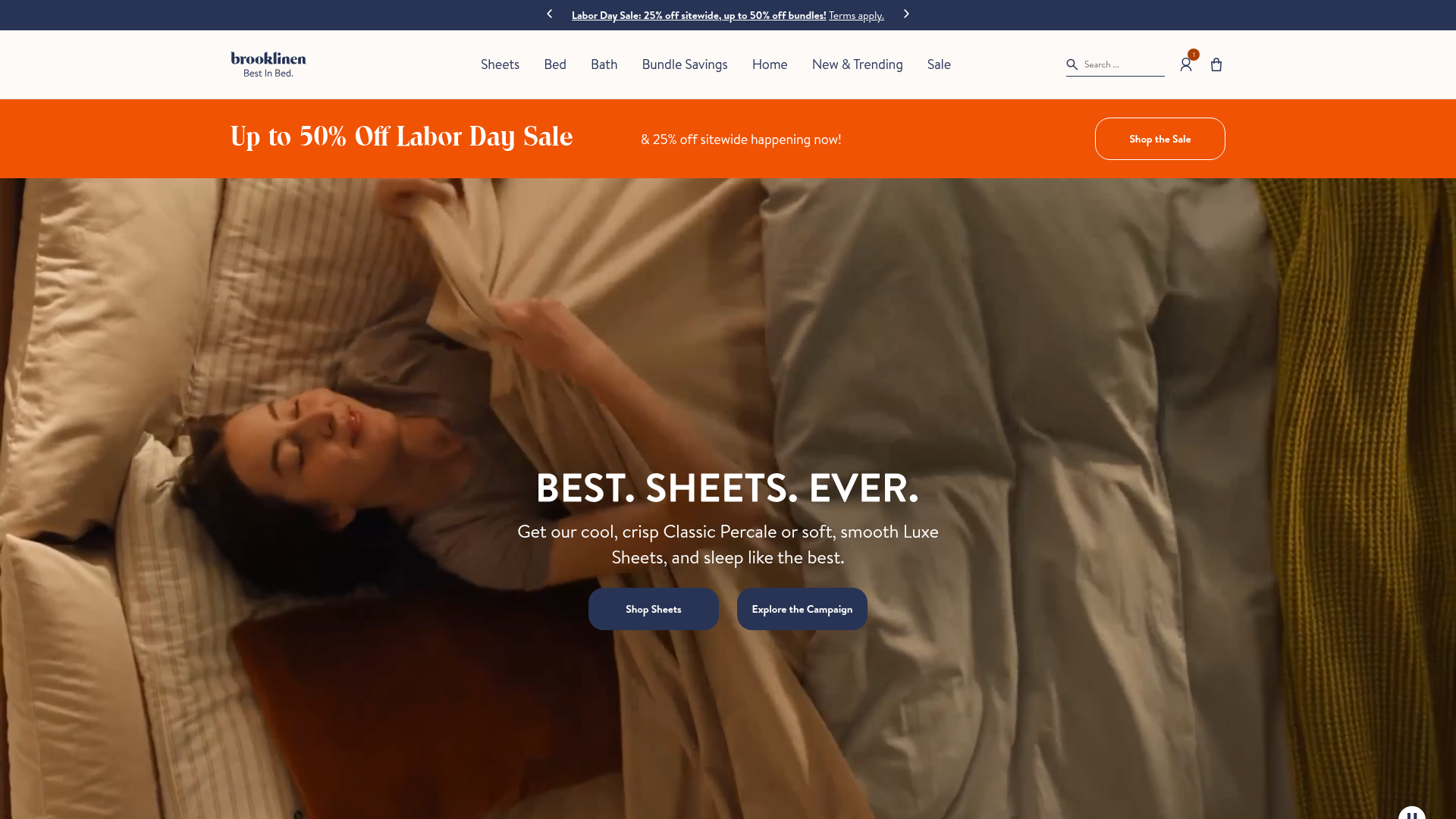
Brooklinen's landing page scores 73 overall—a strong result that reflects solid aesthetic execution and reasonable functional scaffolding. The aesthetic layer (76/100) is the page's most confident dimension, suggesting visual design and layout choices are working. But the functional score of 72 and practices score of 72 obscure a cluster of high-severity issues that directly threaten both user inclusion and sales conversion. The page performs adequately as a general browsing experience, but fails acutely as a time-limited promotional vehicle and as an accessible destination for screen reader users and users with assistive technology.
Observed UX signals
- Criticalfunctional
Accessibility
45 images are missing alt text, including key product and campaign images ('Bed Level 4 Image', 'Sale Level 4 Image', 'Sheets Level 4 Image', etc.). This creates a serious barrier for screen reader users and undermines SEO for product discovery.
- Majorfunctional
Trust & Credibility
The '175k+ 5-Star Reviews' claim is present but lacks visible attribution, reviewer names, or linked proof. The testimonial section references celebrity endorsements ('Robby Hoffman, Mikal Bridges, Alana Haim, and Ben Marshall') but provides no photos, titles, or context to verify authenticity.
- Majorfunctional
Conversion Optimization
Multiple competing CTAs above the fold ('Shop the Sale', 'Shop Sheets', 'Explore the Campaign') create choice paralysis. The primary conversion goal (Labor Day sale) is not clearly prioritized over secondary product browsing actions.
More UX reviews
Browse all →How does your site score?
Get the same layer-by-layer UX review for your homepage, pricing page, or product page.