Booking website UX review
A scan-backed analysis of how Booking performs across usability, visual clarity, and UX best practices. Use it as a reference for what to borrow, what to question, and what to test on your own site.
Sensei score: 70 out of 100
Aesthetic
71Practices
70How Booking looks
The verdict
A high-performing page undermined by modal friction
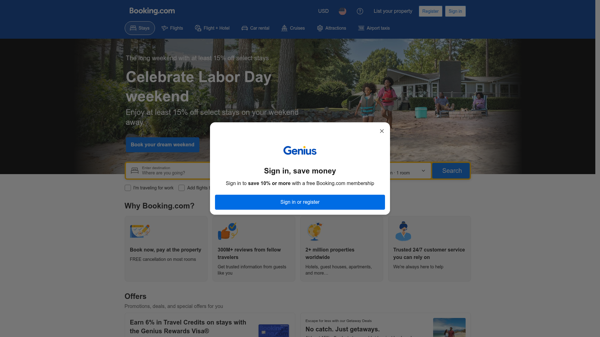
Booking.com's landing page scores 70/100 overall—a strong result that reflects solid execution across functional, aesthetic, and practice layers. All three dimensions score within a narrow band (70–71), suggesting the page is competent but not exceptional in any single area. The real diagnostic emerges not from the overall score but from the specific friction points that prevent the page from reaching 75+: a modal dialog that blocks the primary search interface, competing CTAs that fragment user intent, and missing alt text on trust-signal images. These are not edge cases. They directly impede the core booking flow and accessibility compliance.
Observed UX signals
- Criticalfunctional
Focus & Hierarchy
Modal dialog ('Sign in, save money') is blocking the primary search interface. The Genius sign-in overlay obscures the search form and competing CTAs ('Sign in or register' button), creating friction for users who want to proceed without authentication. This modal appears to be triggered automatically and prevents immediate task completion.
- Majorfunctional
Conversion Optimization
Primary CTA copy is generic and benefit-agnostic. 'Book your dream weekend' is motivational but does not clarify the immediate action or outcome. The search form itself lacks clear microcopy explaining what happens next (e.g., 'See prices and availability' or 'Compare 2+ million properties').
- Majorfunctional
Accessibility
Four key decorative/illustrative images lack alt text: FreeCancellation.png, Reviews.png, TripsGlobe.png, and CustomerSupport.png. These images support the 'Why Booking.com?' value propositions and are not purely decorative—they reinforce trust signals. Screen reader users cannot access this context.
More UX reviews
Browse all →How does your site score?
Get the same layer-by-layer UX review for your homepage, pricing page, or product page.