Bombas website UX review
A scan-backed analysis of how Bombas performs across usability, visual clarity, and UX best practices. Use it as a reference for what to borrow, what to question, and what to test on your own site.
Sensei score: 72 out of 100
Aesthetic
76Practices
70How Bombas looks
The verdict
A mid-tier performer held back by foundational clarity
Bombas lands at 72/100—a respectable score that masks uneven execution across functional, aesthetic, and practice layers. The aesthetic layer (76) is the page's strongest asset, suggesting the visual design, color, typography, and composition are coherent and polished. But the functional layer (71) and practices layer (70) reveal friction points that undermine conversion potential. The gap between aesthetic confidence and functional clarity is diagnostic: the page looks good but doesn't guide visitors effectively toward action or build trust at the moment it matters most.
Observed UX signals
- Majorfunctional
Clarity
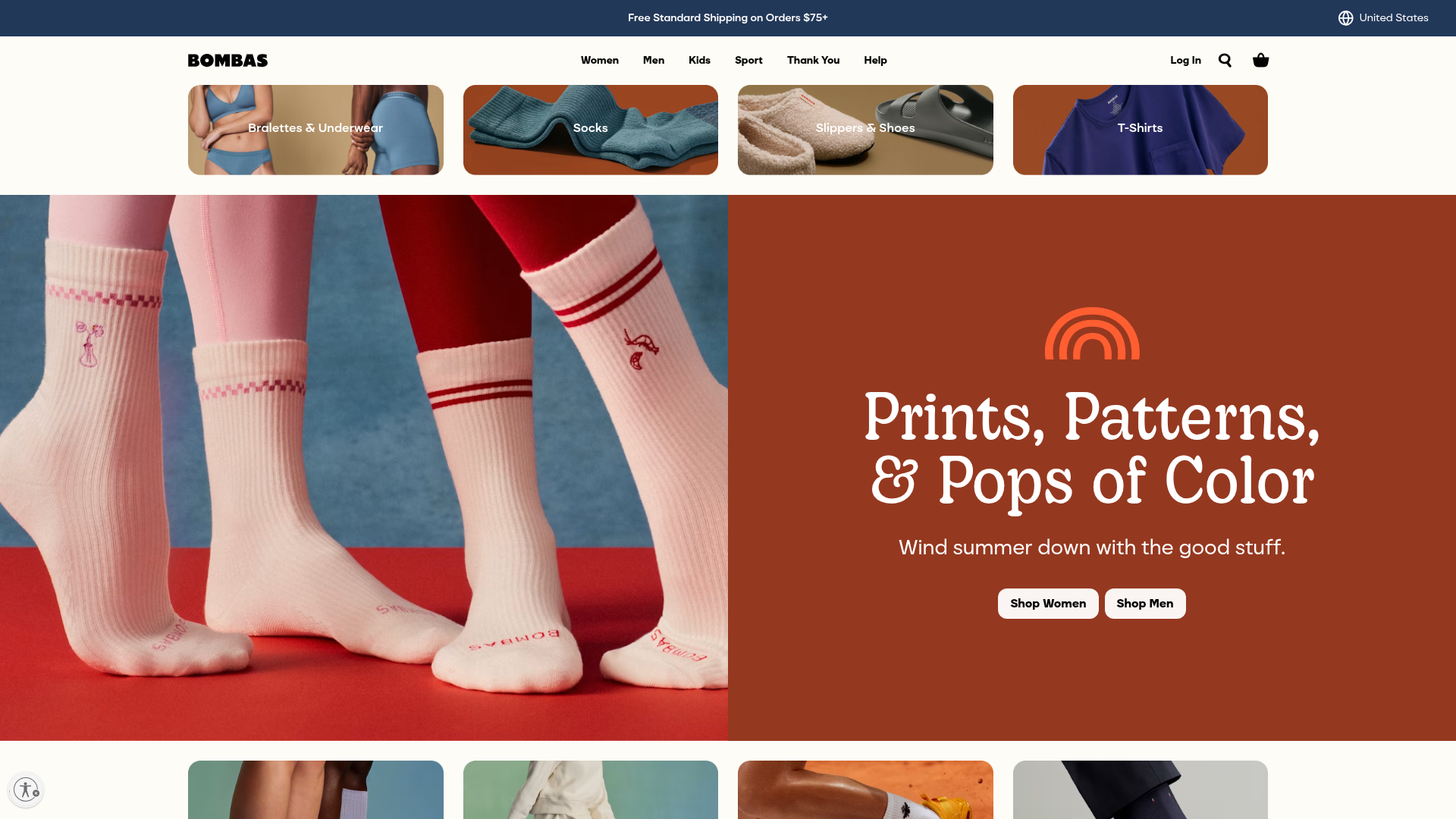
Hero section leads with product category ('Prints, Patterns, & Pops of Color') rather than brand value or primary benefit. The subheading 'Wind summer down with the good stuff' is vague and doesn't clearly communicate what Bombas offers or why a visitor should care.
- Majorfunctional
Trust & Credibility
Social proof is present ('200 MILLION+ DONATIONS', 'ONE PURCHASED = ONE DONATED') but lacks specificity and context. The '200 million donations' claim is stated three times but without attribution, timeline, or third-party verification. No visible customer testimonials, ratings, or press mentions above the fold.
- Majorfunctional
Accessibility
Three images lack alt text (all marked as 'null'). These appear to be product category images (Underwear, Socks, Slippers, T-Shirts) that are functional navigation elements, not decorative. Screen reader users cannot identify these product categories.
More UX reviews
Browse all →How does your site score?
Get the same layer-by-layer UX review for your homepage, pricing page, or product page.