Betterment website UX review
A scan-backed analysis of how Betterment performs across usability, visual clarity, and UX best practices. Use it as a reference for what to borrow, what to question, and what to test on your own site.
Sensei score: 77 out of 100
Aesthetic
79Practices
73How Betterment looks
The verdict
A strong landing with conversion friction at the critical moment
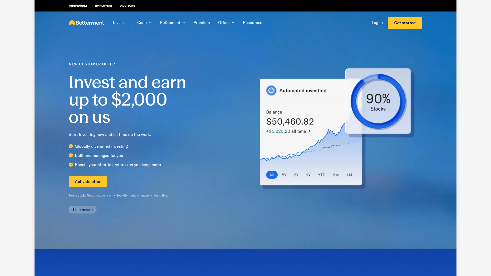
Betterment's landing page scores 77/100—a solid performance anchored by confident aesthetic and functional execution. The visual design (79) and core interaction patterns (78) work well enough to support a complex financial product. But the Practices layer (73) reveals a meaningful gap: the page's architecture actively undermines conversion at the moment users are most ready to act. Three competing primary CTAs above the fold—'Activate offer' for a $2,000 investment bonus, 'Get started' for general signup, and 'Activate offer' for a cash APY boost—create choice paralysis rather than clear intent. This is not a minor navigation issue; it's a direct friction point in the conversion funnel.
Observed UX signals
- Majorfunctional
Focus & Hierarchy
Multiple competing primary CTAs above the fold create choice paralysis. Hero section contains 'Activate offer' (for $2,000 investment bonus), 'Get started' (general signup), and 'Activate offer' (for cash APY boost) without clear visual or messaging hierarchy distinguishing which action is primary.
- Majorfunctional
Conversion Optimization
Primary CTA copy lacks benefit orientation and urgency. 'Activate offer' is passive and transactional; it does not communicate the outcome (e.g., 'Earn $2,000 bonus' or 'Start investing free'). Risk reversal is absent—no mention of free trial, money-back guarantee, or 'cancel anytime' near signup CTAs.
- Majorfunctional
Conversion Optimization
Offer terms and conditions are buried in small print ('Terms apply. New customers only. See offer details.') without clear explanation of eligibility, minimum deposit, or deadline. Users must click 'See offer details' to understand what they're activating, creating friction at the moment of conversion.
More UX reviews
Browse all →How does your site score?
Get the same layer-by-layer UX review for your homepage, pricing page, or product page.
Scan your websiteSign in to run a fresh private scan