Bench website UX review
A scan-backed analysis of how Bench performs across usability, visual clarity, and UX best practices. Use it as a reference for what to borrow, what to question, and what to test on your own site.
Sensei score: 78 out of 100
Aesthetic
80Practices
77How Bench looks
The verdict
A capable landing with unresolved service hierarchy
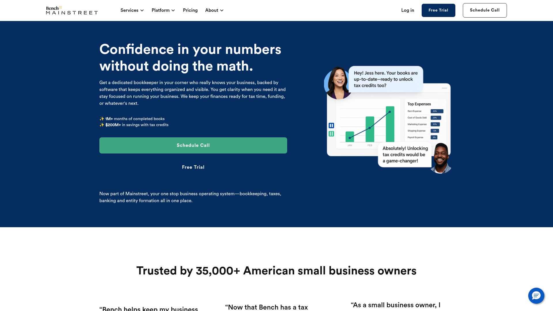
Bench scores 78/100 overall, with aesthetic execution (80) outpacing functional clarity (78) and practice maturity (77). The page demonstrates solid visual and messaging craft—the hero headline 'Confidence in your numbers without doing the math' is benefit-focused and immediately conveys value—but the underlying structure asks too much of visitors. Six distinct service categories (Monthly Bookkeeping, Catch Up Bookkeeping, Income Tax Filing, Tax Resolution, Hire a Bookkeeper, Banking by Mainstreet) appear without clear indication of which is primary, forcing users to infer the intended entry point. For a financial services landing, this ambiguity is a meaningful friction point.
Observed UX signals
- Majorfunctional
Clarity
Hero headline 'Confidence in your numbers without doing the math' is benefit-focused and clear, but the page structure presents multiple competing service categories (Monthly Bookkeeping, Catch Up Bookkeeping, Income Tax Filing, Tax Resolution, Hire a Bookkeeper, Banking by Mainstreet) without clear hierarchy or guidance on which is primary. A visitor must infer which service is the main offering.
- Majorfunctional
Trust & Credibility
Social proof is present ('Trusted by 35,000+ American small business owners', '1M+ months of completed books', '$200M+ in savings with tax credits') but lacks specificity in the hero. The testimonial section references 'Bria Hash' with a quote, but no company, title, or industry context is visible in the extracted data, reducing credibility impact.
- Majorfunctional
Focus & Hierarchy
Multiple CTAs compete for attention in the hero and immediately below: 'Schedule Call' (green button), 'Free Trial' (text link), and 'Book a demo' (repeated in Services section). No clear visual or copy distinction indicates which action is primary or most appropriate for a first-time visitor.
More UX reviews
Browse all →How does your site score?
Get the same layer-by-layer UX review for your homepage, pricing page, or product page.