Basecamp website UX review
A scan-backed analysis of how Basecamp performs across usability, visual clarity, and UX best practices. Use it as a reference for what to borrow, what to question, and what to test on your own site.
Sensei score: 79 out of 100
Aesthetic
78Practices
79How Basecamp looks
The verdict
A solid performer with navigation friction at the entry point
Basecamp's landing page scores 79/100 overall, placing it in the strong range across all three dimensions: Functional (81), Aesthetic (78), and Practices (79). The page demonstrates competent execution in most areas—the core content is well-organized, the visual design maintains reasonable restraint, and the site follows established UX conventions. However, the score masks a specific structural problem that emerges immediately above the fold: the navigation and header region contains too many competing focal points for a landing page whose primary job is to convert visitors into sign-ups. This tension between overall polish and entry-point clarity is the defining diagnostic of the page.
Observed UX signals
- Majorfunctional
Focus & Hierarchy
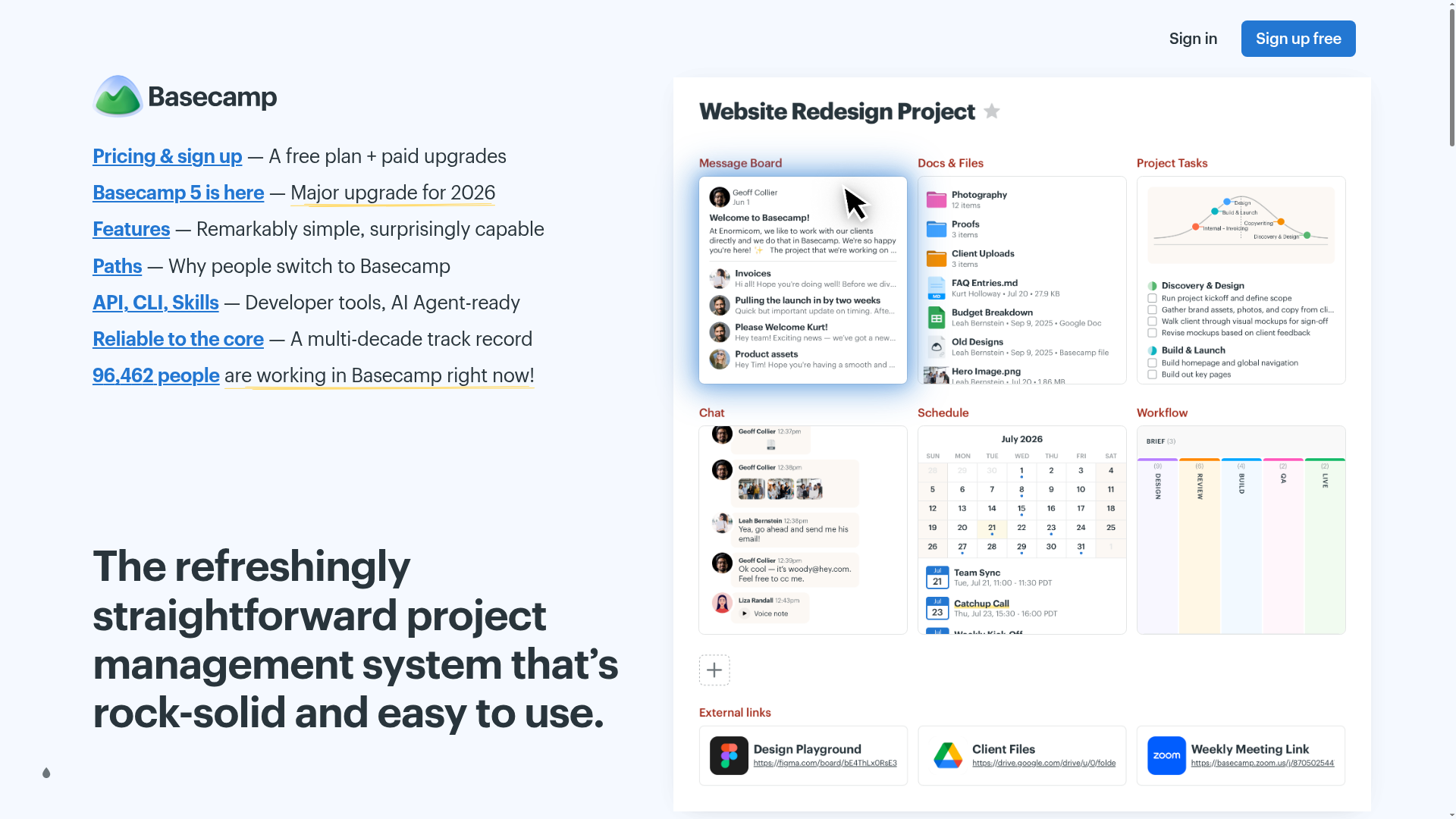
Navigation menu contains 6 primary links (Pricing & sign up, Basecamp 5 is here, Features, Paths, API/CLI/Skills, Reliable to the core) plus a live user counter, creating competing focal points above the fold. This violates Hick's Law and dilutes attention from the primary conversion goal.
- Majorfunctional
Conversion Optimization
Primary CTA copy is generic ('Sign up free') and appears multiple times (at least 3 instances in header/nav). No benefit-oriented microcopy, risk reversal, or urgency signal is visible near the hero or early CTAs. The value proposition ('straightforward project management system') is feature-focused, not outcome-focused.
- Minorfunctional
Clarity
Hero subheading 'Tell me if this sounds about right' is conversational but vague. It does not clearly signal the next action or reinforce the value proposition. Visitors may not immediately understand what 'right' means in this context.
More UX reviews
Browse all →How does your site score?
Get the same layer-by-layer UX review for your homepage, pricing page, or product page.