Awaytravel website UX review
A scan-backed analysis of how Awaytravel performs across usability, visual clarity, and UX best practices. Use it as a reference for what to borrow, what to question, and what to test on your own site.
Sensei score: 73 out of 100
Aesthetic
78Practices
71How Awaytravel looks
The verdict
A visually confident page held back by decision friction
Awaytravel's landing page scores 73/100—a strong result that masks a structural tension between aesthetic execution and functional clarity. The aesthetic layer leads at 78, reflecting polished imagery and visual hierarchy in product presentation. But functional and practices layers both sit at 71, indicating that beneath the visual surface, the page asks too much of visitors before they can act. The gap is not dramatic, but it is diagnostic: this is a page that looks good and performs adequately, yet leaves conversion potential on the table through unclear messaging and competing priorities.
Observed UX signals
- Majorfunctional
Clarity
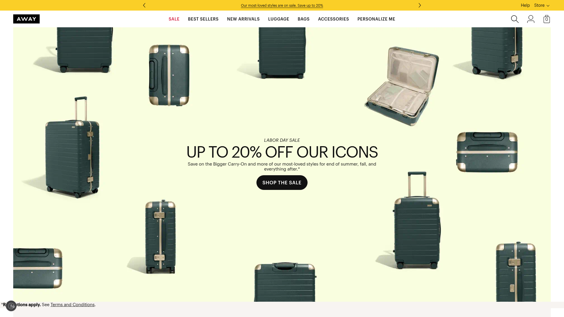
Primary campaign message 'UP TO 20% OFF OUR ICONS' uses product jargon ('ICONS') instead of benefit language. Visitors must infer that 'ICONS' refers to bestselling luggage styles. The subheading clarifies this partially ('Save on the Bigger Carry-On and more of our most-loved styles'), but the headline itself creates a 1-2 second cognitive gap.
- Majorfunctional
Trust & Credibility
Social proof is present but sparse and buried. Press mentions (NYT Wirecutter, Condé Nast Traveler) appear only in the 'Worth the hype' section, well below the fold. No visible user ratings, review counts, or customer testimonials above the fold. The page relies on brand recognition rather than explicit credibility signals at the point of decision.
- Majorfunctional
Accessibility
12 images lack alt text (marked as 'null' or empty). While some product images have descriptive alt text ('Two beige suitcases and a woven bag on a wooden deck...'), many placeholder or decorative images are missing descriptions. This creates barriers for screen reader users and fails WCAG 2.1 Level A standards.
More UX reviews
Browse all →How does your site score?
Get the same layer-by-layer UX review for your homepage, pricing page, or product page.