Asana website UX review
A scan-backed analysis of how Asana performs across usability, visual clarity, and UX best practices. Use it as a reference for what to borrow, what to question, and what to test on your own site.
Sensei score: 76 out of 100
Aesthetic
79Practices
73How Asana looks
The verdict
A 76-point landing page with aesthetic polish masking functional friction
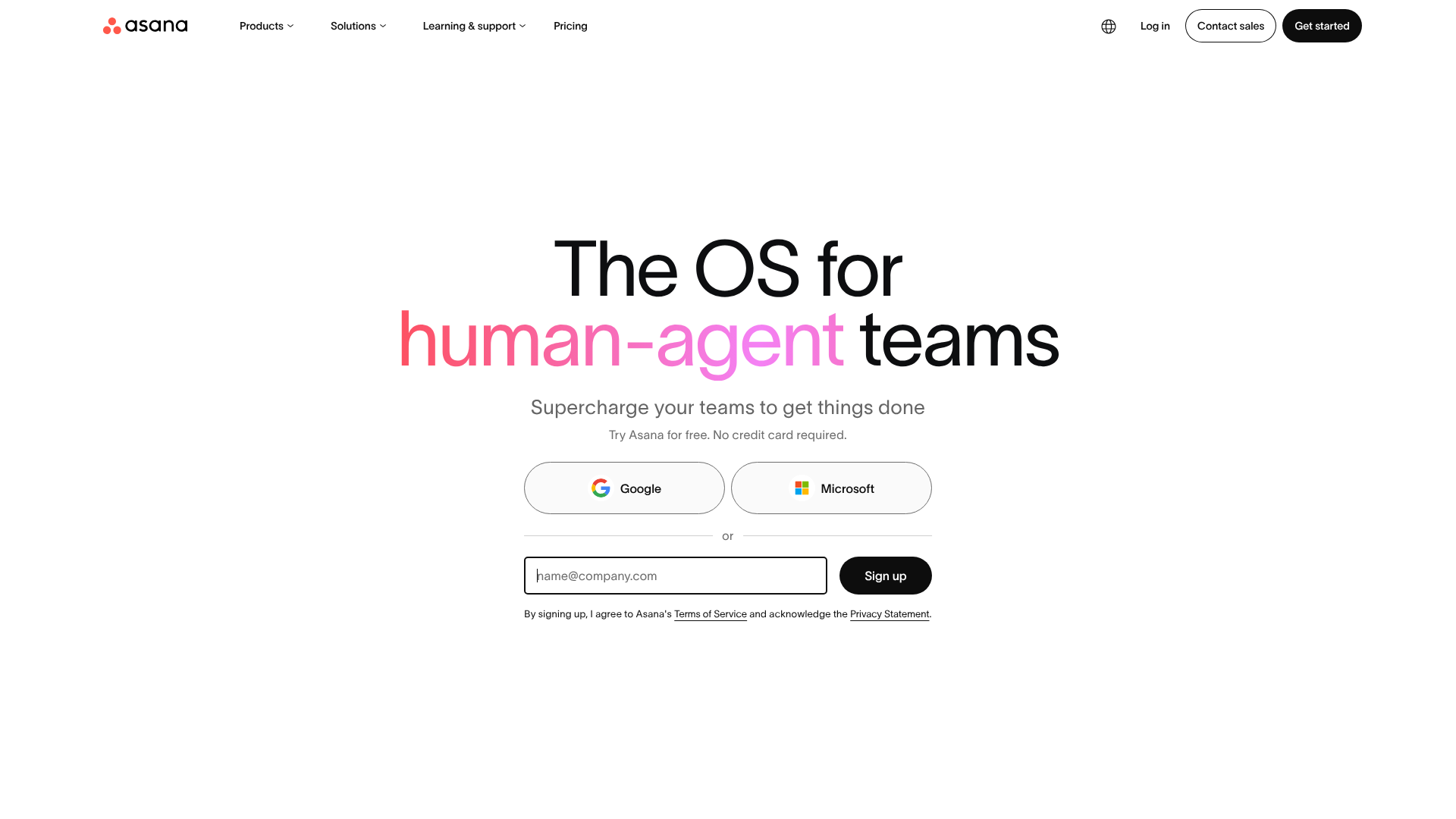
Asana's homepage scores 76/100 overall—a strong result that reflects polished visual design (79 in aesthetics) and solid foundational practices (73). However, the functional layer (75) reveals the real story: the page looks confident but asks visitors to make too many decisions too quickly, and the core value proposition remains opaque without prior product knowledge. The gap between aesthetic and functional scores suggests a common pattern—a well-designed page that doesn't yet optimize for its primary job: converting unfamiliar visitors into engaged users.
Observed UX signals
- Majorfunctional
Clarity
Hero headline 'The OS for human-agent teams' is feature-focused and abstract. While the subhead 'Supercharge your teams to get things done' adds benefit language, the primary value proposition relies on understanding what 'OS' and 'human-agent' mean without explanation. A visitor unfamiliar with Asana's positioning may not immediately grasp the core job this solves.
- Majorfunctional
Trust & Credibility
Social proof is present ('85% of Fortune 100 companies choose Asana¹') but appears mid-page after the signup form, not prominently above the fold. The footnote marker (¹) suggests a citation, but no source or methodology is visible on the page, which weakens credibility. No customer logos, user count, or testimonials are visible in the hero section.
- Majorfunctional
Conversion Optimization
Primary CTA is 'Sign up' with generic copy. The form field placeholder 'name@company.com' is present, but there is no risk reversal language visible (e.g., 'Try free for 14 days' or 'No credit card required' appears in small text below the form). The microcopy 'Try Asana for free. No credit card required.' is present but positioned below the form, not inline with the CTA button, reducing its persuasive impact at the moment of decision.
More UX reviews
Browse all →How does your site score?
Get the same layer-by-layer UX review for your homepage, pricing page, or product page.