Arc website UX review
A scan-backed analysis of how Arc performs across usability, visual clarity, and UX best practices. Use it as a reference for what to borrow, what to question, and what to test on your own site.
Sensei score: 74 out of 100
Aesthetic
77Practices
70How Arc looks
The verdict
A browser landing page caught between testimonial and benefit
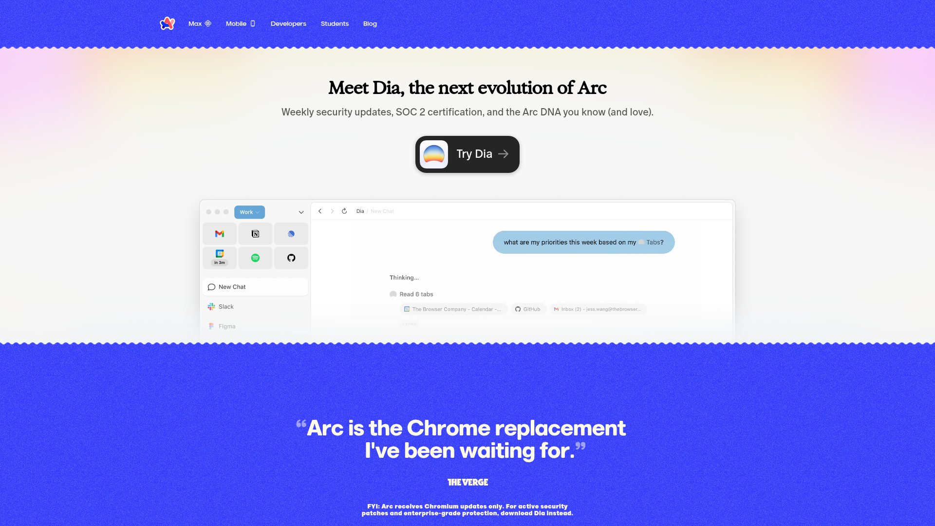
Arc's landing page scores 74/100 overall—a respectable result that masks a fundamental tension between how the page introduces itself and what it actually promises. The aesthetic layer (77/100) performs strongest, suggesting the visual and stylistic execution is confident. The functional layer (73/100) and practices layer (70/100) reveal where clarity breaks down. The core problem is structural: Arc leads with a user testimonial ('Arc is the Chrome replacement I've been waiting for') rather than a clear, benefit-driven value proposition. The actual product benefit—'a calmer, more personal internet'—exists only in metadata and secondary copy, never claiming the hero space where it would shape first impressions. This is not a copywriting flourish; it's a hierarchy failure that forces visitors to infer what Arc does instead of being told.
Observed UX signals
- Majorfunctional
Clarity
Primary value proposition is buried and unclear. The hero headline 'Arc is the Chrome replacement I've been waiting for' is a testimonial quote, not a benefit statement. The actual product benefit ('a calmer, more personal internet') appears only in meta description and secondary copy, not prominently in the hero.
- Majorfunctional
FocusHierarchy
Multiple competing CTAs create choice paralysis. The page presents 'Try Dia' (external product), 'Download Arc for Windows', and 'Download Arc for Mac' with equal visual weight in the hero area. Users must decide between three distinct actions without clear guidance on which is primary.
- Majorfunctional
ConversionOptimization
Risk reversal and objection handling are absent. The page does not address common browser-switching friction: 'Will my bookmarks transfer?', 'Is it really private?', 'What about compatibility?'. The security disclaimer ('Arc receives Chromium updates only. For active security patches... download Dia instead') actually creates doubt by suggesting the main product is less secure.
More UX reviews
Browse all →How does your site score?
Get the same layer-by-layer UX review for your homepage, pricing page, or product page.