Airbnb website UX review
A scan-backed analysis of how Airbnb performs across usability, visual clarity, and UX best practices. Use it as a reference for what to borrow, what to question, and what to test on your own site.
Sensei score: 78 out of 100
Aesthetic
76Practices
76How Airbnb looks
The verdict
A strong landing page undermined by modal friction and search-form ambiguity
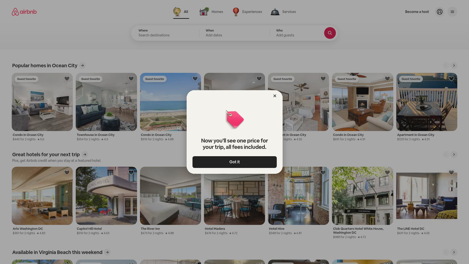
Airbnb's homepage scores 78/100 overall—a solid result that reflects genuine strengths in functional design (81) and visual polish (76). The page successfully presents a massive inventory across 220+ countries and regions, maintains consistent design language, and displays individual listing ratings prominently. Yet the score masks a critical usability problem: a modal dialog announcing consolidated pricing sits directly atop the primary search form and product carousel, forcing users to dismiss it before they can search or browse. This is not a minor cosmetic issue. The modal creates competing focal points and blocks the main conversion path—the very action the homepage exists to enable. For a site where search-to-booking is the core funnel, this friction is structural, not decorative.
Observed UX signals
- Majorfunctional
Focus & Hierarchy
Modal dialog ('Now you'll see one price for your trip, all fees included') overlays primary search form and product carousel, creating competing focal points and blocking the main conversion path. Users must dismiss the modal before interacting with the search interface or browsing listings.
- Majorfunctional
Conversion Optimization
Primary search form uses generic placeholder text ('Search destinations', 'Add dates', 'Add guests') without benefit-oriented microcopy. No risk reversal, urgency, or objection-handling visible near the search CTA. The search button lacks descriptive text (appears to be icon-only based on visual).
- Minorfunctional
Conversion Optimization
All product cards use identical CTA pattern ('See all' links) across multiple sections, reducing differentiation between sections and making it unclear which 'See all' leads where without careful reading. No benefit-oriented language on CTAs.
More UX reviews
Browse all →How does your site score?
Get the same layer-by-layer UX review for your homepage, pricing page, or product page.