Activecampaign website UX review
A scan-backed analysis of how Activecampaign performs across usability, visual clarity, and UX best practices. Use it as a reference for what to borrow, what to question, and what to test on your own site.
Sensei score: 69 out of 100
Aesthetic
66Practices
70How Activecampaign looks
The verdict
A mid-range performer caught between clarity and ambition
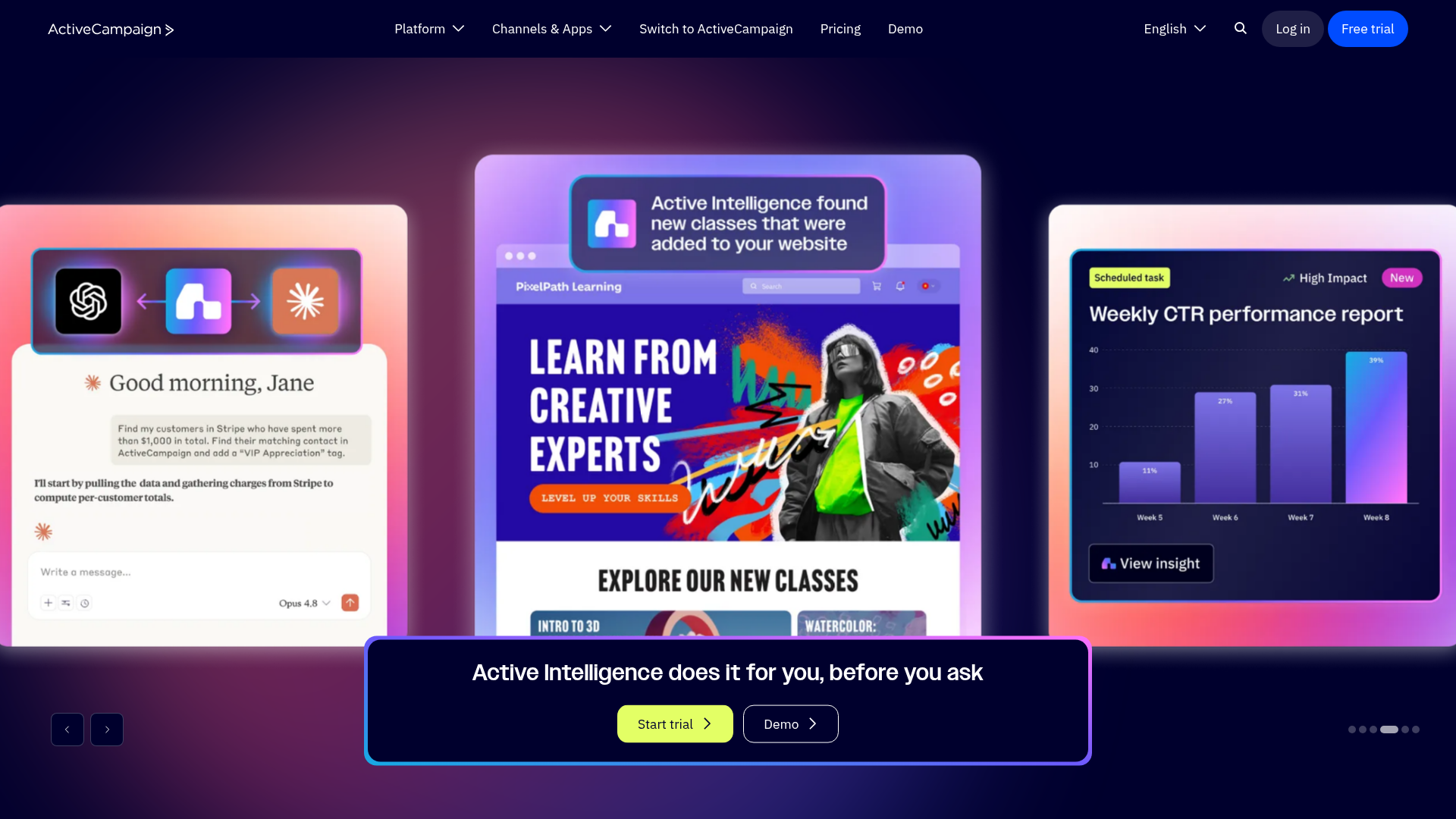
ActiveCampaign's landing page scores 69/100 overall, with functional and practices layers both at 70 but aesthetic confidence trailing at 66. The gap is diagnostic: the page attempts to showcase a sophisticated AI-driven platform but undermines that ambition with competing narratives, unclear hierarchy, and visual fragmentation. For a B2B SaaS landing page, this score reflects a site that has the structural bones of a conversion machine—trust signals exist, CTAs are present, feature benefits are articulated—but lacks the decisive clarity and visual restraint that would make those elements work in concert.
Observed UX signals
- Majorfunctional
Clarity
Primary value proposition is buried and feature-focused. The hero headline 'Cut 13 hours of marketing busywork each week with autonomous marketing' leads with a time-saving metric rather than the core transformation. The subheading 'Active Intelligence does it for you, before you ask' is vague and doesn't clearly explain what the product does or why it matters to a first-time visitor.
- Majorfunctional
focusHierarchy
Multiple competing CTAs above the fold create choice paralysis. The page presents 'Start trial', 'Demo', 'Request your demo', and 'Request Pricing' as equally prominent options in the hero and modal sections. No clear visual or hierarchical distinction guides users toward the primary conversion path.
- Majorfunctional
conversionOptimization
Risk reversal is weak and buried. The free trial CTA mentions '14 days free' and 'No credit card needed' only in the footer section, not prominently in the hero. The primary 'Start trial' button lacks inline reassurance, making users uncertain about commitment friction.
More UX reviews
Browse all →How does your site score?
Get the same layer-by-layer UX review for your homepage, pricing page, or product page.