Runway website UX review
A scan-backed analysis of how Runway performs across usability, visual clarity, and UX best practices. Use it as a reference for what to borrow, what to question, and what to test on your own site.
Sensei score: 76 out of 100
Aesthetic
78Practices
78How Runway looks
The verdict
A capable page held back by unclear positioning
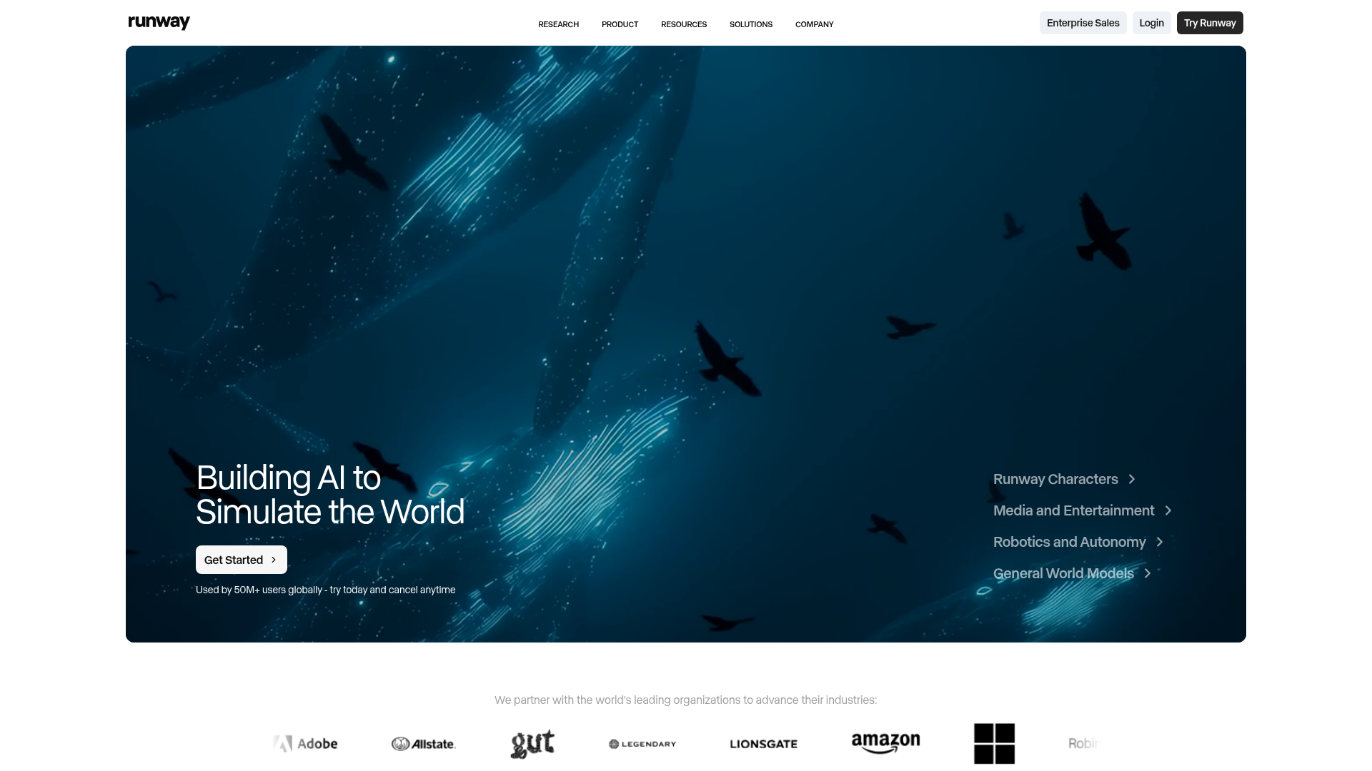
Runway's landing page scores 76/100 overall—a strong result—but the distribution of its layer scores reveals a telling imbalance. Aesthetic and Practices layers both score 78, indicating solid visual design and adherence to standard UX conventions. The Functional layer, however, drops to 71, a gap that points to a coherent problem: the page looks and feels professional, but visitors struggle to understand what to do or why they should care. For a multi-product platform introducing three distinct offerings (Creative, Dev, Robotics), this friction is costly. The page does not fail outright; it simply asks too much of the visitor to construct meaning from scattered signals.
Observed UX signals
- Majorfunctional
Clarity
Hero headline 'Building Real-World Intelligence' is abstract and feature-focused rather than benefit-focused. The subheading explains the technical capability but not why a visitor should care or what they can do with it. Users must infer the value proposition across multiple product sections.
- Majorfunctional
focusHierarchy
Page presents three distinct product platforms (Creative, Dev, Robotics) with equal visual weight and multiple CTAs ('Try now', 'Learn more', 'Get API Key', 'Contact Sales') without clear hierarchy. A first-time visitor cannot quickly determine which product to engage with or what the primary conversion path is.
- Majorfunctional
trustCredibility
Social proof section states 'We partner with the world's leading organizations to advance their industries' but displays only 7 company logos without context, attribution, or specific use cases. No user count, testimonial, or quantified impact is visible above the fold to establish credibility.
More UX reviews
Browse all →How does your site score?
Get the same layer-by-layer UX review for your homepage, pricing page, or product page.
Scan your websiteSign in to run a fresh private scan