Sensei UX Review
Perplexity Website UX Review
A scan-backed analysis of how Perplexity performs across usability, visual clarity, and UX best practices. Use it as a reference for what to borrow, what to question, and what to test on your own site.
Sensei Score
50/100
red tier, scanned Jun 25, 2026Aesthetic
47Practices
54How Perplexity looks
What the score says about Perplexity
Overall Performance: A Landing Page Obscured by Its Own Mechanics
Perplexity's landing page scores 50/100 overall—a weak result that reflects a fundamental misalignment between intent and execution. The Functional layer (49/100) and Aesthetic layer (47/100) both underperform, while Practices (54/100) barely edges above the midline. The core issue is not a lack of product clarity in isolation, but rather a cascade of competing elements that prevent users from understanding what Perplexity does and why they should try it. A cookie policy consent overlay dominates the hero section, the visual hierarchy fragments attention across multiple navigation links and buttons, and the primary conversion action remains ambiguous. For a landing page, where the first 2–3 seconds determine whether a visitor engages or bounces, this structural confusion is critical.
What Works: Practices Layer Shows Baseline Compliance
The Practices score of 54/100 indicates that Perplexity has implemented foundational standards—likely including responsive design intent, basic accessibility markup, and adherence to consent regulations. The presence of a cookie policy overlay, while visually disruptive, demonstrates legal compliance awareness. The page includes navigation structure (Discover, Finance, Health, Academic, Patents) that suggests content organization and possibly SEO consideration. These elements are necessary but insufficient; compliance does not drive conversion or user confidence. The Practices layer's modest lead over Functional and Aesthetic suggests the team has prioritized legal and structural correctness over user experience clarity—a common pattern in regulated or compliance-heavy environments, but one that undermines the landing page's primary job: to communicate value and drive action.
Critical Failures: Cookie Overlay Eclipses Product Value
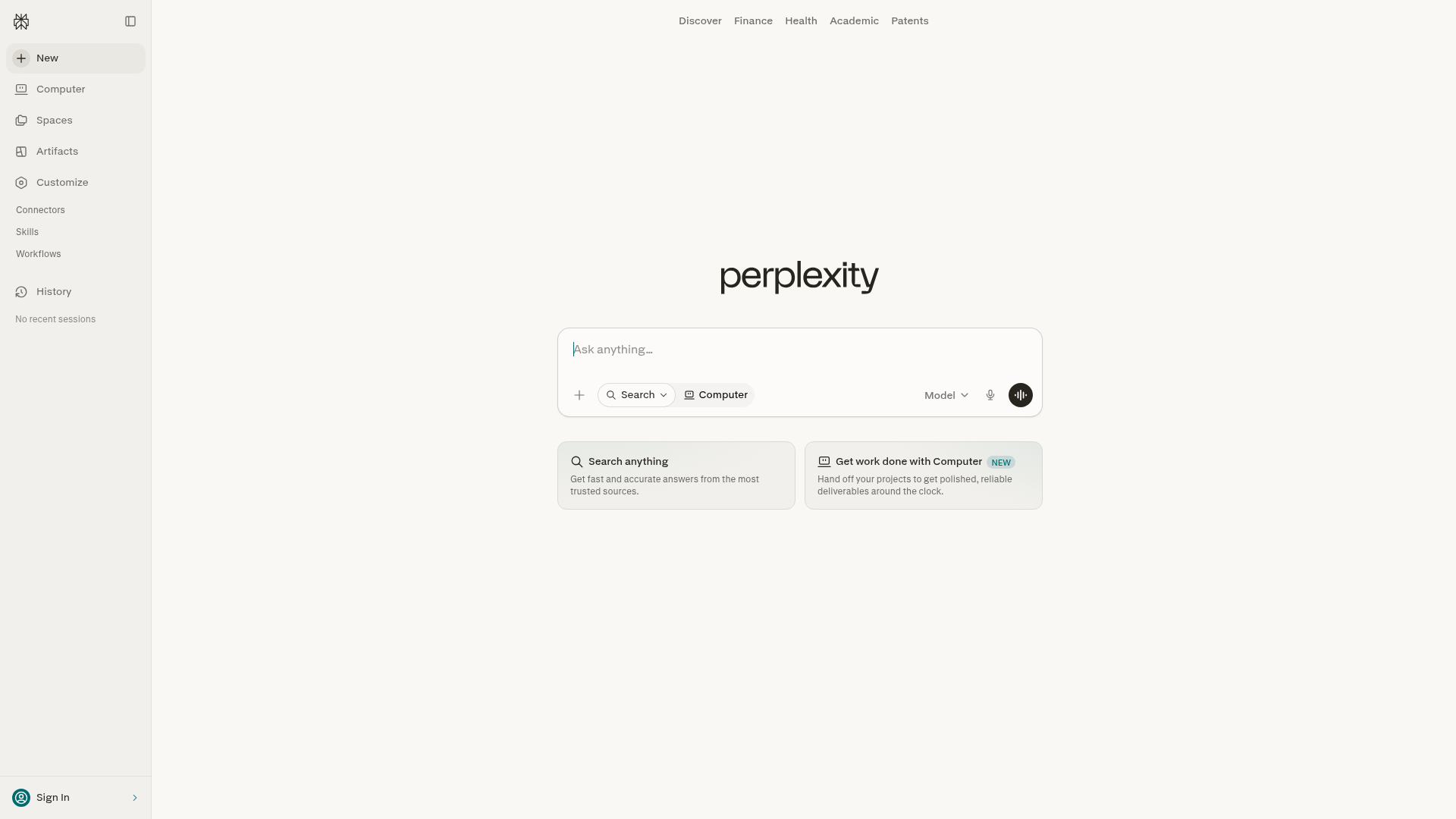
The most damaging finding is the Clarity observation: the page is dominated by cookie policy text rather than product value. The hero section should immediately answer 'What is Perplexity?'—instead, users encounter 'Cookie Policy' as the primary heading, with consent buttons ('Decline optional', 'Got it') and repeated legal language occupying prime real estate. The actual product benefit ('Get fast and accurate answers from the most trusted sources') is buried and forced to compete for attention.
This is compounded by a fractured focus hierarchy. Multiple focal points vie simultaneously: the cookie overlay, navigation links, the search input placeholder ('Ask anything…'), and the product copy. No single primary action emerges as obvious. The 'Ask anything…' input suggests a search-driven CTA, but it lacks visual prominence or positioning as the main call-to-action. A 'Sign In' button is present but does not serve new user conversion. There is no benefit-driven CTA—no 'Start Free', 'Try Now', or equivalent—visible above the fold.
Trust and credibility are entirely absent. No social proof, user counts, testimonials, or trust badges appear. The meta description claims 'accurate, trusted, and real-time answers' but provides zero evidence: no 'Trusted by X users', no press mentions, no certifications. A single image carries null alt text, forfeiting a potential credibility signal. For a product competing in the AI-search space, where trust is a primary purchase driver, this omission is severe.
Mobile and Aesthetic Concerns: Layout Fragility and Visual Overload
The Aesthetic layer (47/100) reflects perceptual chaos. The cookie overlay obscures primary content and creates immediate cognitive overload; users cannot perceive the page's core value proposition without dismissing the overlay first. This is not a minor UX friction—it is a barrier to comprehension.
The mobile experience is likely compromised. Navigation links and cookie consent buttons are present, but their touch target sizing and mobile reflow are not evident. The page structure suggests a desktop-first layout with multiple competing elements that may not reflow intelligently on small screens. There is no indication that the primary CTA has been repositioned or resized for mobile, a critical oversight given that mobile traffic typically represents 50–70% of landing page visits.
The Functional score of 49/100 underscores that these are not merely aesthetic preferences—they are functional barriers to conversion. A user cannot convert if they do not understand the product, and they cannot understand the product if the hero section is obscured by a consent overlay and the value proposition is buried beneath navigation noise.
Actionable Takeaway: Restore Hierarchy and Defer Legal Friction
The path forward is clear: restore the hero section as the primary focal point, defer the cookie overlay to a less intrusive position (e.g., a footer banner or post-interaction prompt), and establish a single, benefit-driven primary CTA above the fold. The product copy ('Get fast and accurate answers from the most trusted sources') should be the dominant heading, not 'Cookie Policy'. The search input should be visually prominent and positioned as the main action. Navigation links (Discover, Finance, Health, Academic, Patents) should be secondary, not competing for attention in the hero.
Add trust signals immediately: user count, key press mentions, or a brief testimonial. Ensure the mobile layout reflows intelligently, with the primary CTA resized and repositioned for touch. Test the consent overlay placement—consider whether a footer banner or delayed modal would reduce friction without sacrificing compliance.
This is not a redesign; it is a reordering of priorities. The page has the components of a functional landing page. It lacks the clarity and hierarchy to deploy them effectively. Fixing this gap would likely move the overall score from 50 to 65–70 and materially improve conversion metrics.
Observed UX signals
functional / critical
Clarity
Page is dominated by cookie policy text rather than product value proposition. The hero section should communicate what Perplexity does, but instead users see 'Cookie Policy' as the primary heading and repeated cookie consent language. The actual product benefit ('Get fast and accurate answers from the most trusted sources') is buried and competes with legal text.
functional / critical
FocusHierarchy
Multiple competing focal points create confusion: 'Cookie Policy' heading, cookie consent buttons ('Decline optional', 'Got it'), navigation links (Discover, Finance, Health, Academic, Patents), and product copy ('Get fast and accurate answers') all vie for attention without clear hierarchy. No single primary action is obvious.
functional / major
ConversionOptimization
Primary conversion action is unclear. The 'Ask anything…' placeholder text suggests a search input, but it is not visually prominent or positioned as the main CTA. 'Sign In' button is present but does not drive new user conversion. No clear benefit-driven CTA like 'Start Free' or 'Try Now' is visible above the fold.
functional / major
TrustCredibility
No visible social proof, user counts, testimonials, or trust badges above the fold. The meta description claims 'accurate, trusted, and real-time answers' but provides no evidence (e.g., 'Trusted by 10M+ users', press mentions, certifications). The single image has null alt text, providing no visual credibility signal.
functional / major
MobileExperience
Navigation links (Discover, Finance, Health, Academic, Patents) and cookie consent buttons are present but their touch target sizing and mobile reflow are not evident from the data. The page structure suggests a desktop-first layout with multiple competing elements that may not reflow intelligently on small screens. No indication of a mobile-optimized primary CTA placement.
aesthetic / critical
Perceptual Calm & Visual Restraint
The page is dominated by a cookie policy consent overlay that obscures the primary content. The hero section ('Ask anything…', 'Search Computer Model', 'Get fast and accurate answers') is buried beneath competing messaging, creating immediate visual chaos and cognitive overload. Users cannot perceive the page's core value proposition without dismissing the overlay.
More UX reviews
Browse all →Benchmark your own page
Get the same layer-by-layer UX review for your homepage, pricing page, or product page.