Sensei UX Review
Duolingo Website UX Review
A scan-backed analysis of how Duolingo performs across usability, visual clarity, and UX best practices. Use it as a reference for what to borrow, what to question, and what to test on your own site.
Sensei Score
70/100
green tier, scanned Jun 25, 2026Aesthetic
69Practices
68How Duolingo looks
What the score says about Duolingo
Overall Performance: Strong Foundation with Structural Friction
Duolingo's landing page scores 70/100 overall, with functional design (73) leading aesthetic (69) and practices (68). The page demonstrates solid core usability and visual presentation, but structural decisions around goal hierarchy and trust-building create measurable friction for both conversion and accessibility. For a freemium learning platform competing in a crowded market, this score reflects a page that works mechanically but leaves conversion potential on the table—particularly in how it frames credibility and guides user choice.
What Works: Functional Clarity Within Modules
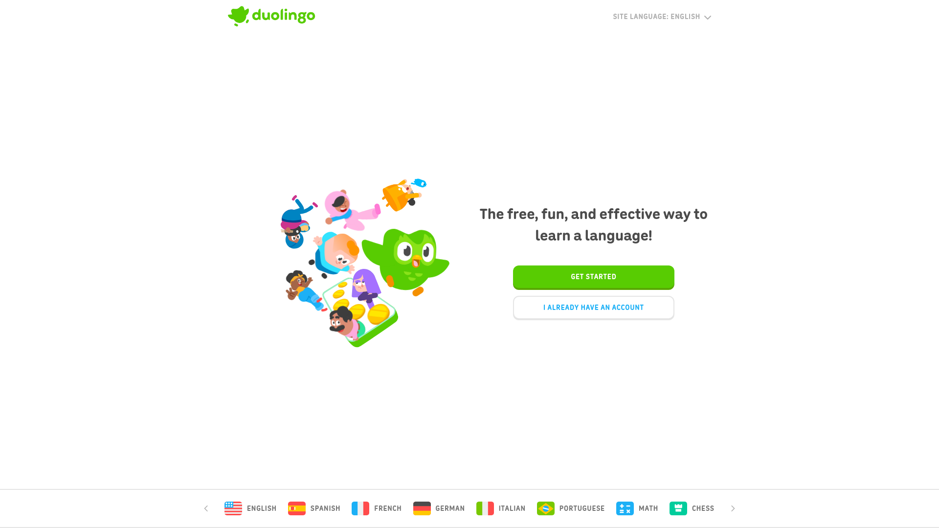
The functional layer's relative strength (73/100) stems from clear, benefit-oriented primary CTAs and distinct visual hierarchy within individual product modules. The 'Try 1 week free' call-to-action is prominently placed and immediately communicates the value proposition. Each of Duolingo's sub-products—language learning, English Test, Schools, and ABC—has its own clear entry point and supporting messaging. This modular clarity allows users to understand what each offering does without ambiguity. The aesthetic layer (69/100) supports this through confident visual presentation that makes the page feel trustworthy and modern, reinforcing Duolingo's brand identity as an accessible, approachable learning platform.
Critical Gap: Accessibility Barriers and Unsubstantiated Claims
Two functional issues significantly undermine the page's effectiveness. First, 42 missing alt text attributes—particularly on vendor logos, app store badges, and feature icons—create a serious accessibility failure. These images likely convey social proof and credibility signals that sighted users process automatically. For screen reader users, this content is invisible, violating WCAG 2.1 AA standards and excluding a meaningful user segment from the page's persuasive messaging.
Second, the page claims to be 'backed by science' and asserts that 'research shows that it works,' but provides no citations, study links, specific metrics, or evidence. For a learning platform, credibility is a primary conversion driver—users are making a decision about how to spend their time and potentially money. Unsubstantiated claims, even if true, read as marketing assertion rather than proof. The absence of visible social proof above the fold (user counts, app ratings, press mentions, or testimonials) compounds this weakness. These gaps directly impact the practices layer (68/100), which measures trust-building and evidence-based communication.
Structural Problem: Six Competing Goals Dilute Conversion Focus
The page's most significant structural weakness is the presence of six distinct primary CTAs above the fold: 'Try 1 week free,' 'Get started,' 'Get your class started,' 'Learn more about ABC,' 'Certify your English,' and multiple language course links. While each module has internal clarity, the overall page lacks a single primary conversion goal. This violates Hick's Law—users experience decision paralysis when faced with too many equally weighted options. A visitor must infer which action the page prioritizes, requiring cognitive effort that reduces conversion likelihood.
Compounding this, the secondary CTA 'I ALREADY HAVE AN ACCOUNT' competes for attention in the hero section, further fragmenting the visual hierarchy. For a freemium product, the hero should guide new users toward signup with minimal friction. Instead, the page presents a branching experience that assumes users already know which Duolingo product they want. Additionally, the primary CTA lacks risk-reversal language—no mention of 'cancel anytime,' 'no credit card required,' or similar friction-reducing reassurances. These omissions are particularly costly for a freemium model where removing signup barriers directly impacts conversion.
Actionable Path Forward
Duolingo's landing page has the visual and functional foundation to perform stronger. Three changes would meaningfully improve conversion and accessibility: (1) Add alt text to all 42 images, prioritizing logos and badges that communicate social proof; (2) Replace unsubstantiated claims with specific evidence—cite research, display user counts or app ratings, or feature testimonials above the fold; (3) Consolidate the hero to a single primary CTA ('Try 1 week free') and move secondary product modules (Schools, ABC, English Test) below the fold or to separate landing pages. This reduces cognitive load, clarifies the primary conversion path, and allows the page to speak directly to the largest user segment: individuals seeking to learn a language. The page's current structure tries to serve multiple audiences simultaneously; focusing the hero on the core use case would strengthen conversion without sacrificing access to secondary products.
Observed UX signals
functional / critical
Accessibility
42 images are missing alt text, including multiple vendor/logo images that likely convey meaning (social proof, app store badges, feature icons). This creates a serious barrier for screen reader users and fails WCAG 2.1 AA standards.
functional / major
Trust & Credibility
Page claims 'backed by science' and 'research shows that it works' but provides no specific evidence, citations, studies, or numbers. No social proof visible above the fold (user counts, ratings, testimonials, press mentions). For a learning platform, credibility is essential to conversion.
functional / major
Conversion Optimization
Primary CTA 'Try 1 week free' is benefit-oriented and visible, but no risk reversal language is present (e.g., 'cancel anytime', 'no credit card required'). For a freemium product, removing friction at signup is critical. Secondary CTA 'I ALREADY HAVE AN ACCOUNT' competes for attention in the hero.
functional / major
Focus & Hierarchy
Page presents 6 distinct product modules (main language learning, English Test, Schools, ABC) with separate CTAs ('Get started', 'Certify your English', 'Get your class started', 'Learn more about ABC'). While each module has clear hierarchy, the overall page lacks a single primary goal, creating cognitive load and diluting conversion focus.
functional / minor
Clarity
Subheading 'free. fun. effective.' uses periods instead of commas, which is stylistically distinctive but may reduce scannability for some users. The three-word structure is clear, but punctuation choice is unconventional.
aesthetic / major
Choice Reduction
The page presents 6 competing primary CTAs above the fold ('Try 1 week free', 'Get started', 'Get your class started', 'Learn more about ABC', 'Certify your English', and multiple language course links). This violates Hick's Law and creates decision paralysis. Users must infer which action is primary, reducing conversion clarity.
More UX reviews
Browse all →Benchmark your own page
Get the same layer-by-layer UX review for your homepage, pricing page, or product page.